HOME TOUR
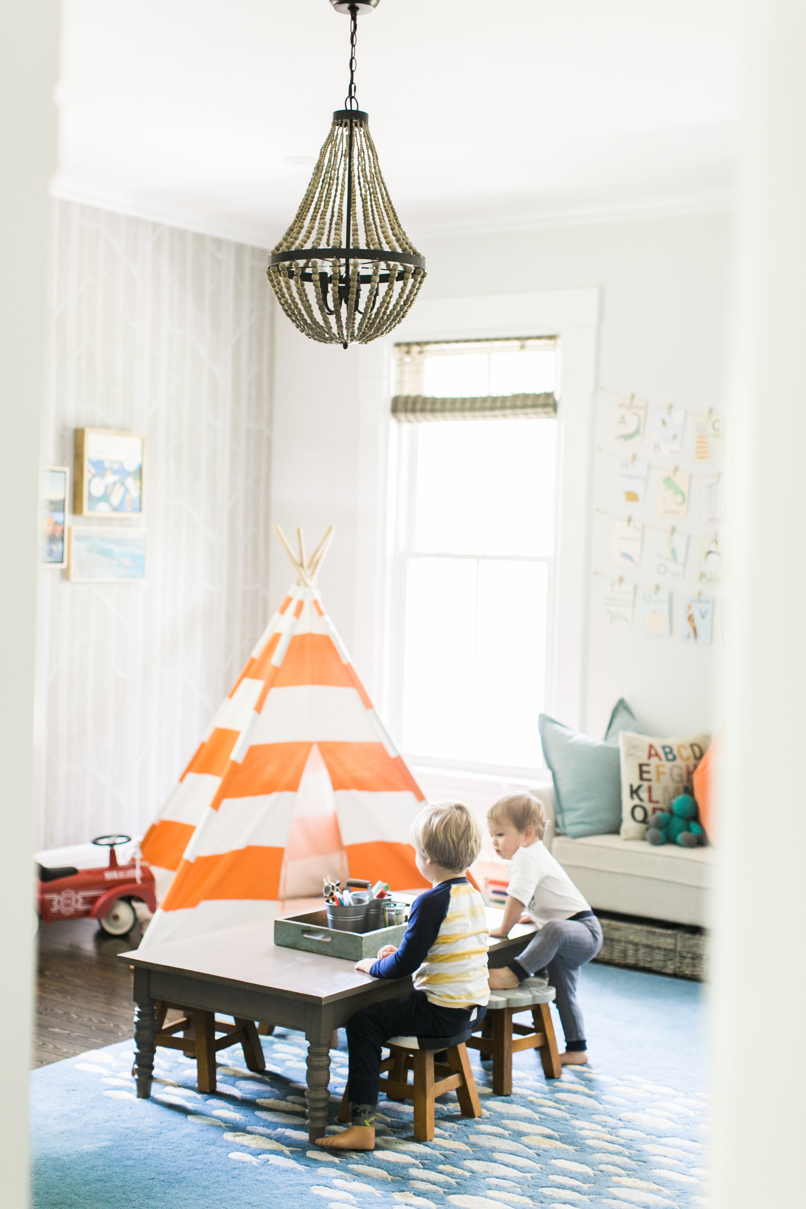
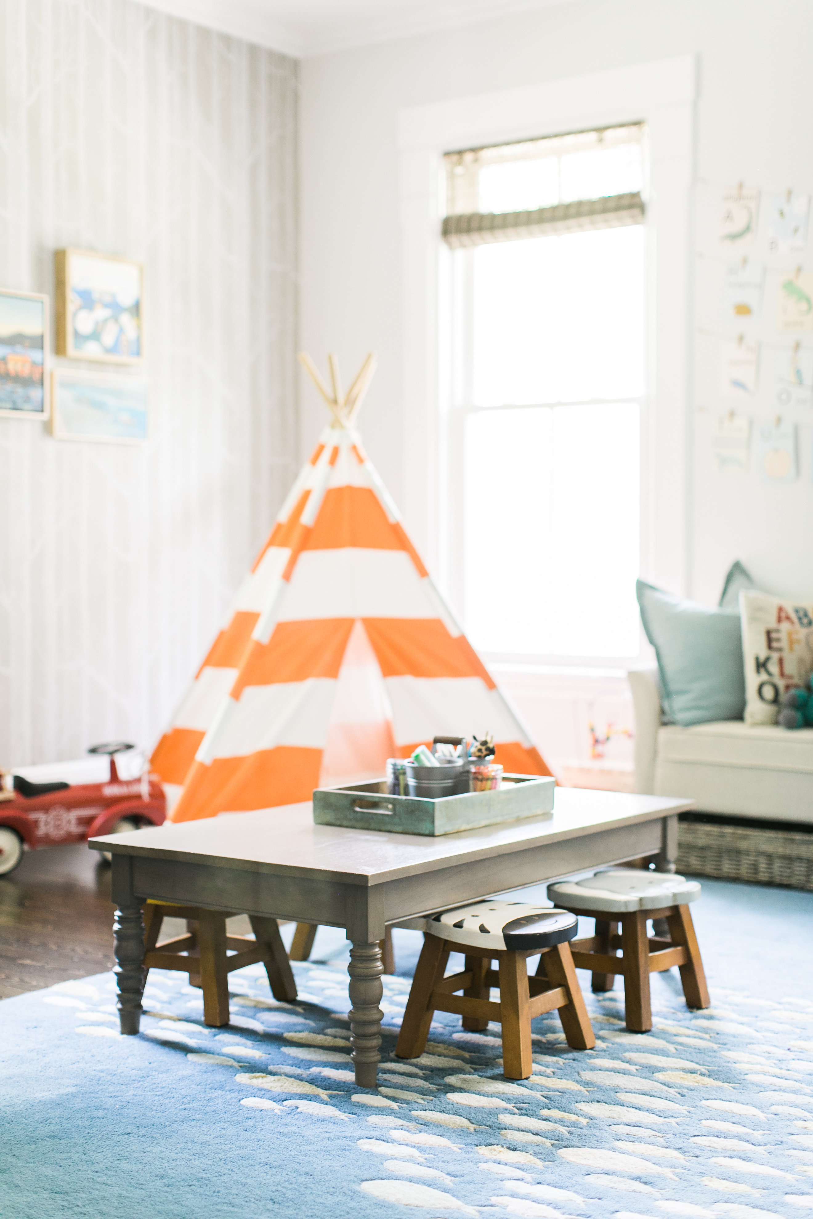
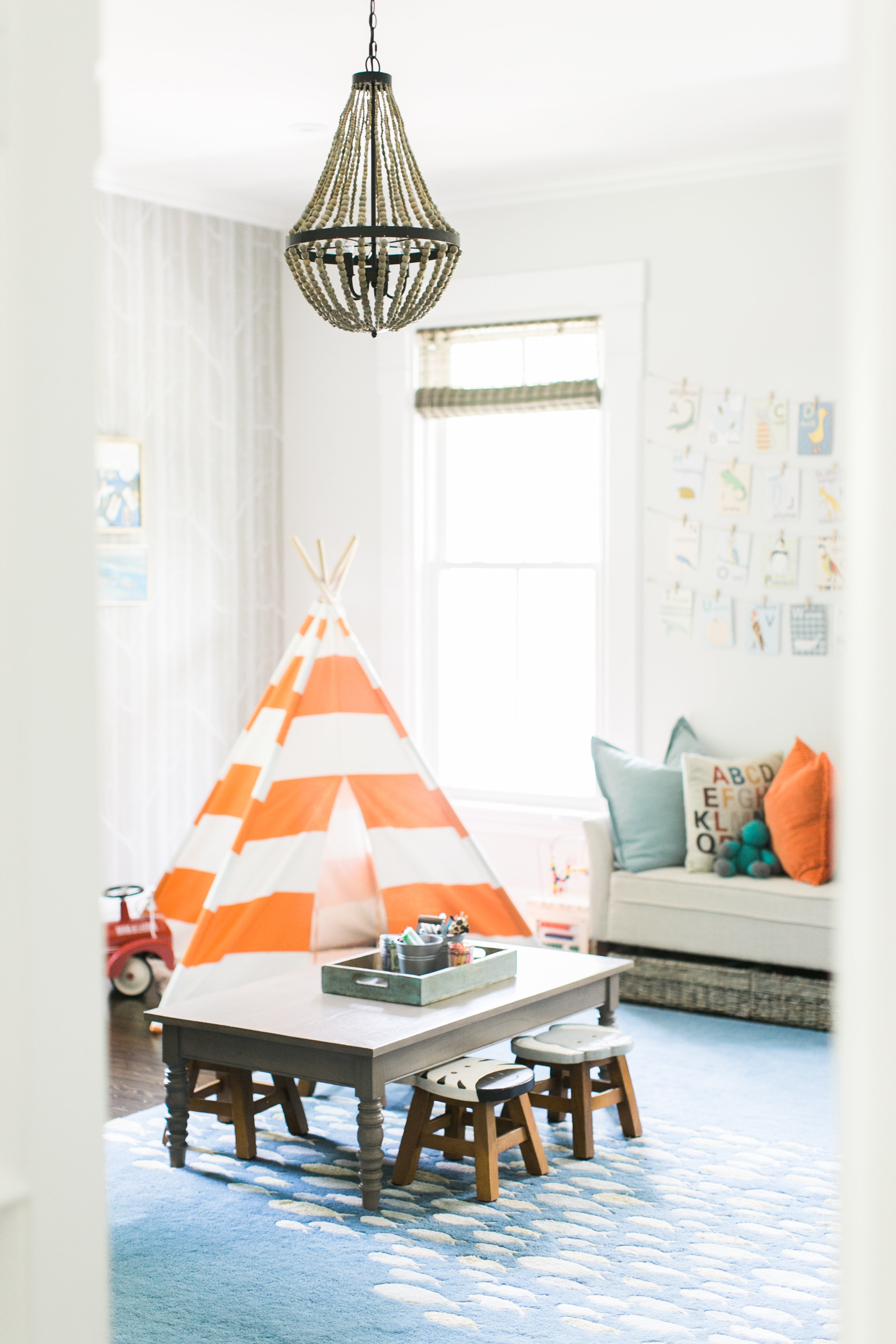
Here’s how the playroom looked at the very beginning. The rug has since been updated, the orange toned down and there are some grand hopes of built-ins in this space soon. But a lot of the same decor pieces are still in place.
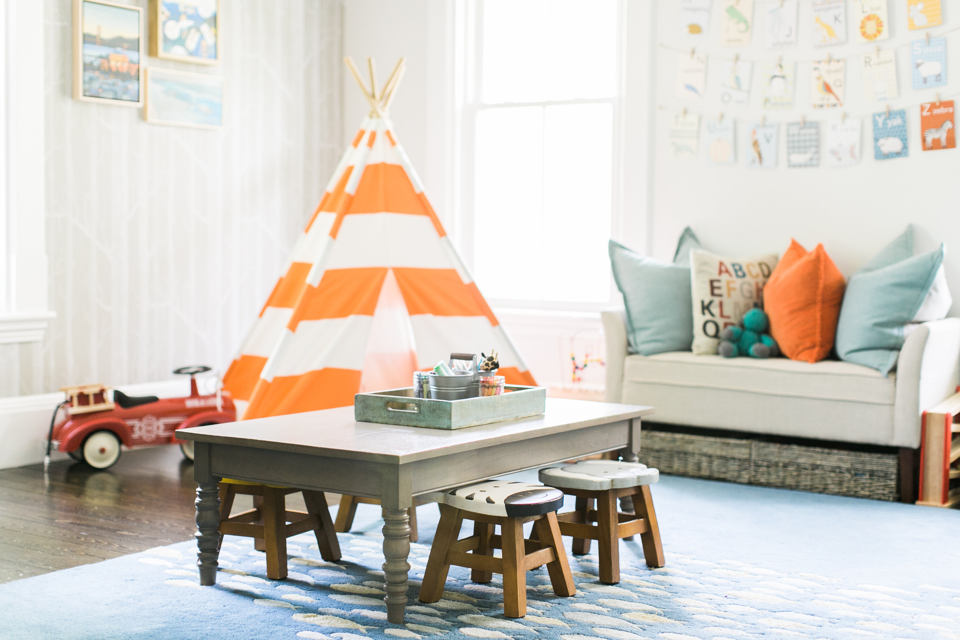
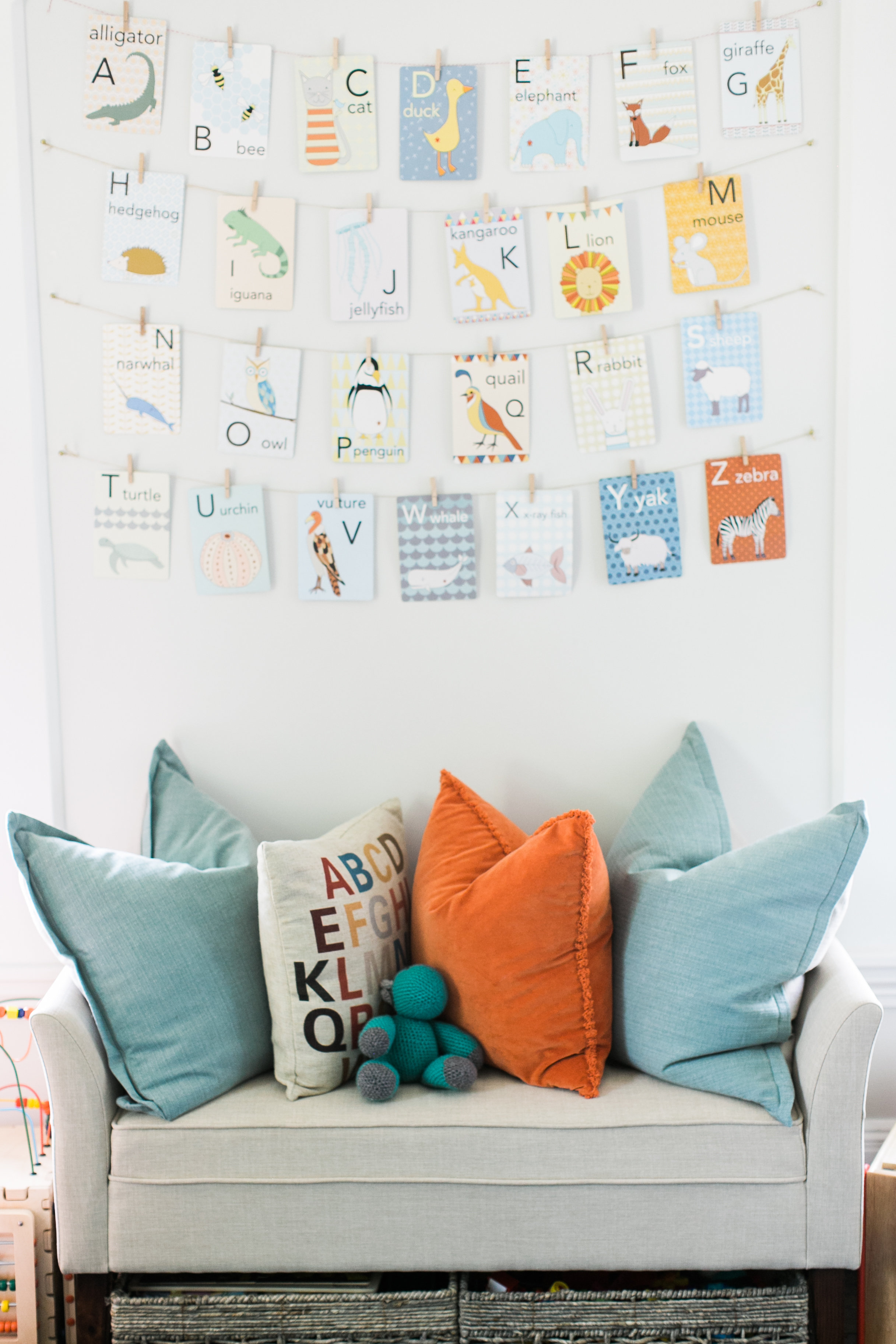
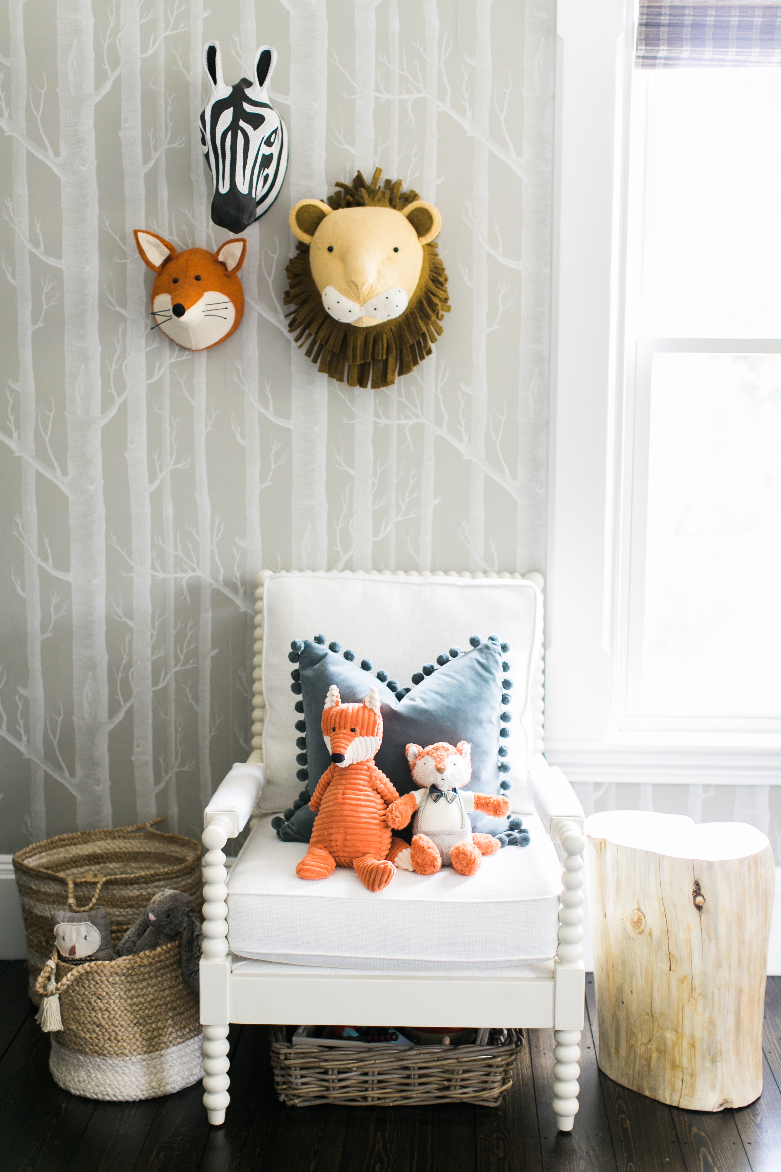
When we first moved into this old house I knew that the tired, dated front room needed to be something special, magical really and it SO was not. (EEK! scroll down for some pretty scary ‘before pictures’). Being the grand old lady she is, this home was built in an era of formal living rooms and parlors and we simply had no need for that. What we needed immediately was a whimsical playroom that gave our two little boys (look how tiny they are!) a place to make memories for years to come / run in circles.
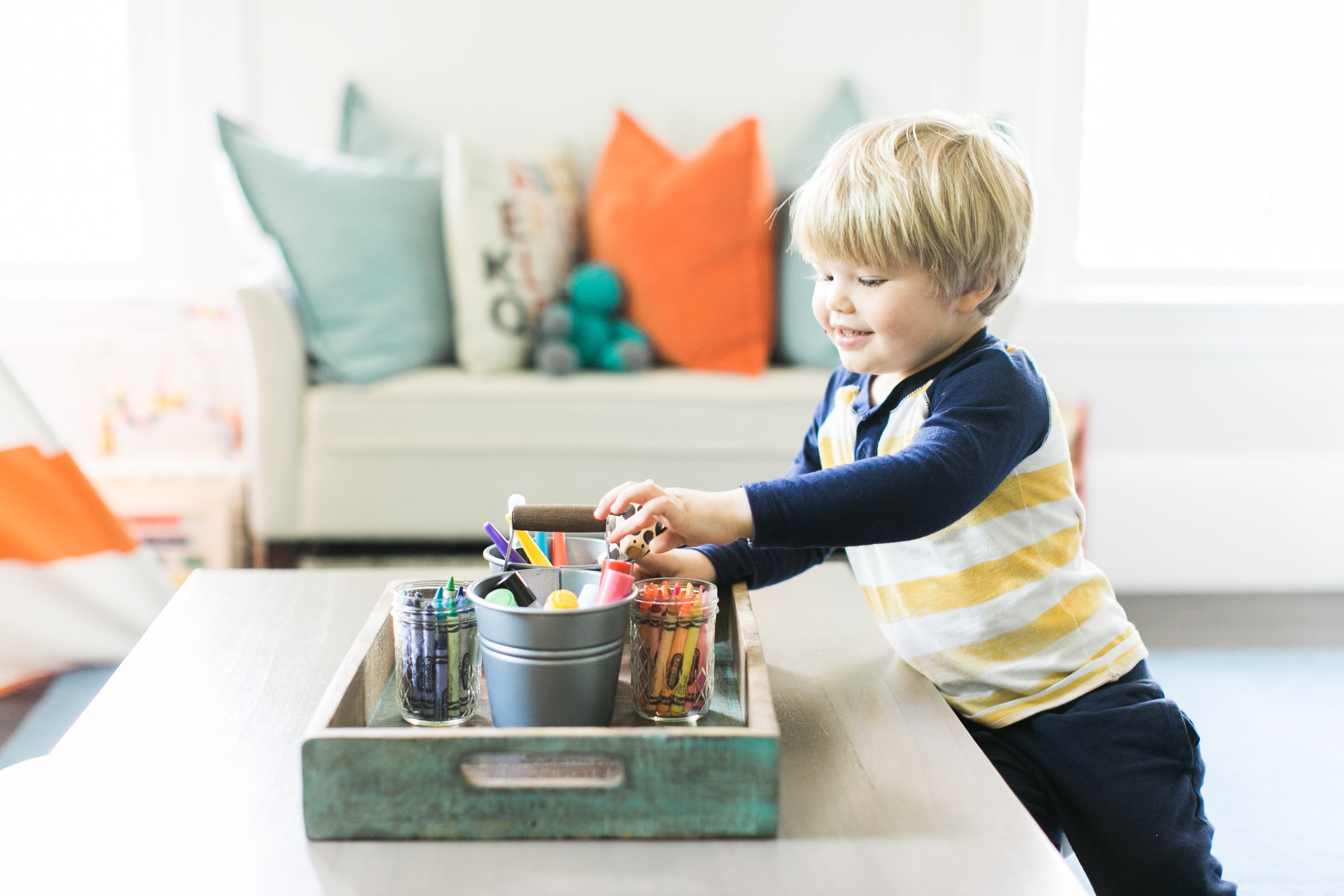
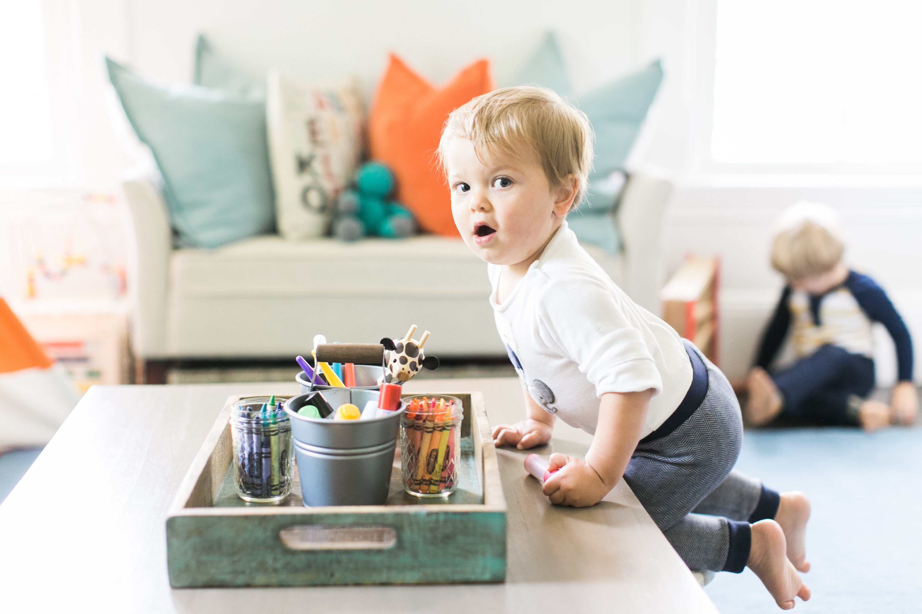
Note the lunch crumb on this kids face! 🙂
When you’re trying to make a whole house feel like home, you can’t always invest the time, $$$ and love that certain spaces need. But the playroom was always high on my list because it’s so used.
PAINT COLORS
We stuck with soothing grey tones throughout the house and this room is no exception. The walls are Benjamin Moore Paper White and I can not say enough about this color. Go now and paint something this! It blends so nicely into the accent wall of Cole & Son’s Woods wallpaper it is almost as if they are soul mates.
WALLPAPER
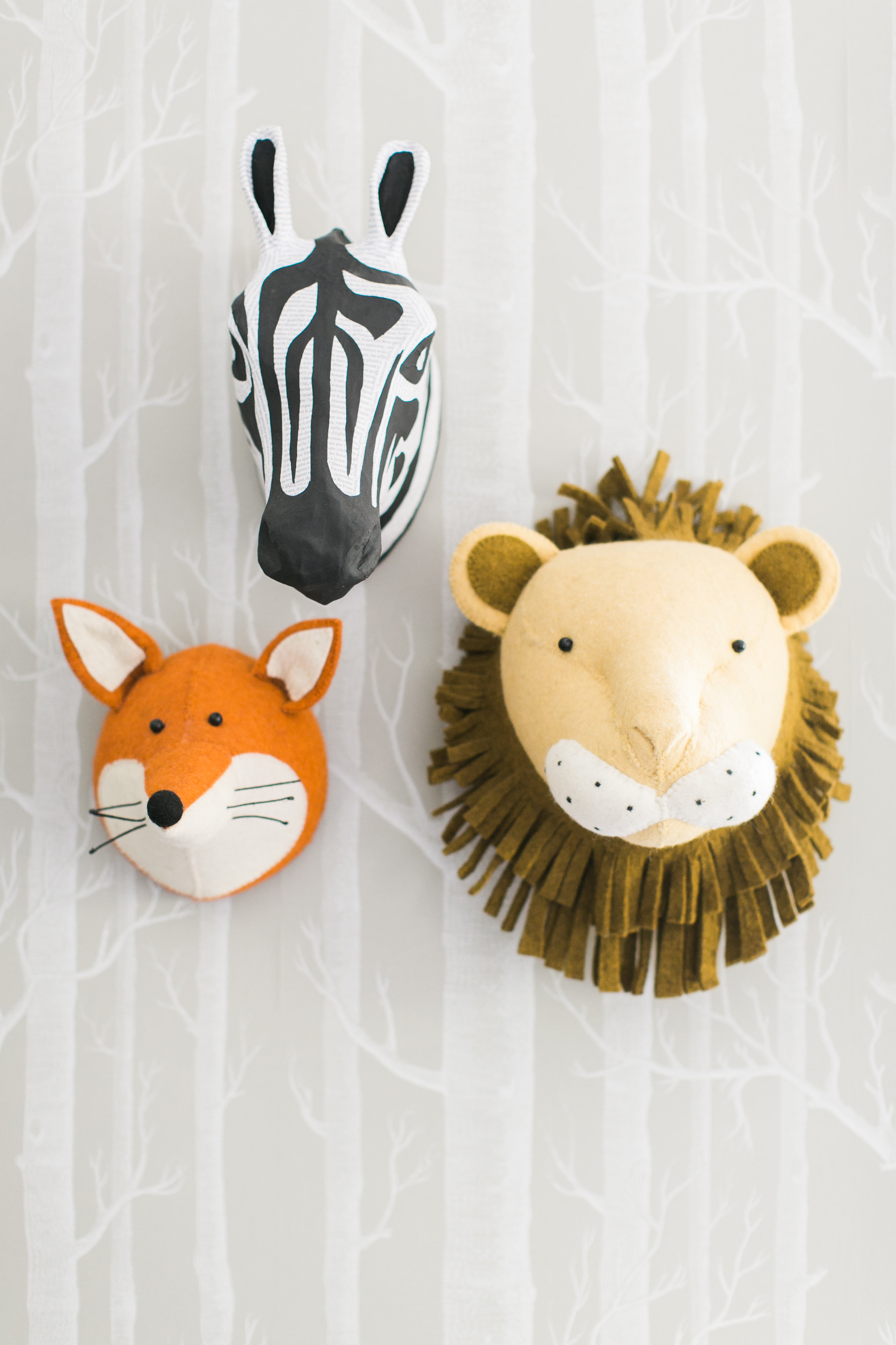
Now speaking of wallpaper, I ordered samples of this wallpaper in every color way possible and hung them up, debated long and hard between the traditional light grey/black color way and the taupe. In the end, I am so so pleased we went with the taupe. It has a beautiful softness that bounces light well. It balances out the room and blends nicely with all the other adjacent rooms. Now, I was a wee bit skeptical to let my husband install it. I held on tight to the rolls while he pried them out of my arms telling me we weren’t dropping a grand for an installer. Sooo…I took some deep breaths and walked around the block AND in spite of my lack of confidence, we realized quickly he has a hidden talent. He’s the official wallpaper-er of Woodlawn Ave.
I love a lot of neutrals and whites but this was a playroom. So initially we punched it up a bit with some pops of blues, teals, and orange. It makes the room fun. It screams little boys. And they love it. Now I’m looking for some ways to add in “girly” after the addition of Aubrey in 2019.
PLAY SIGN
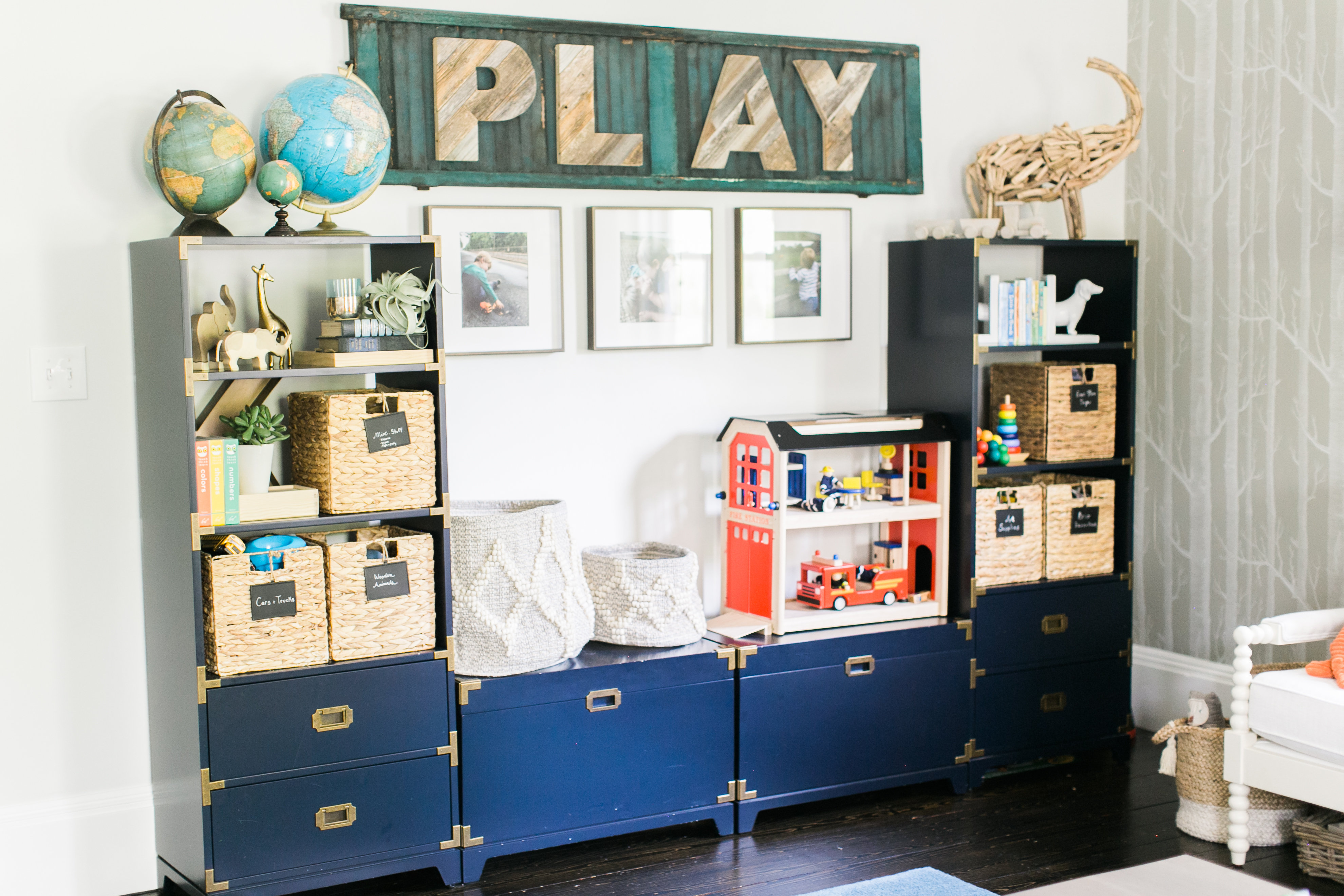
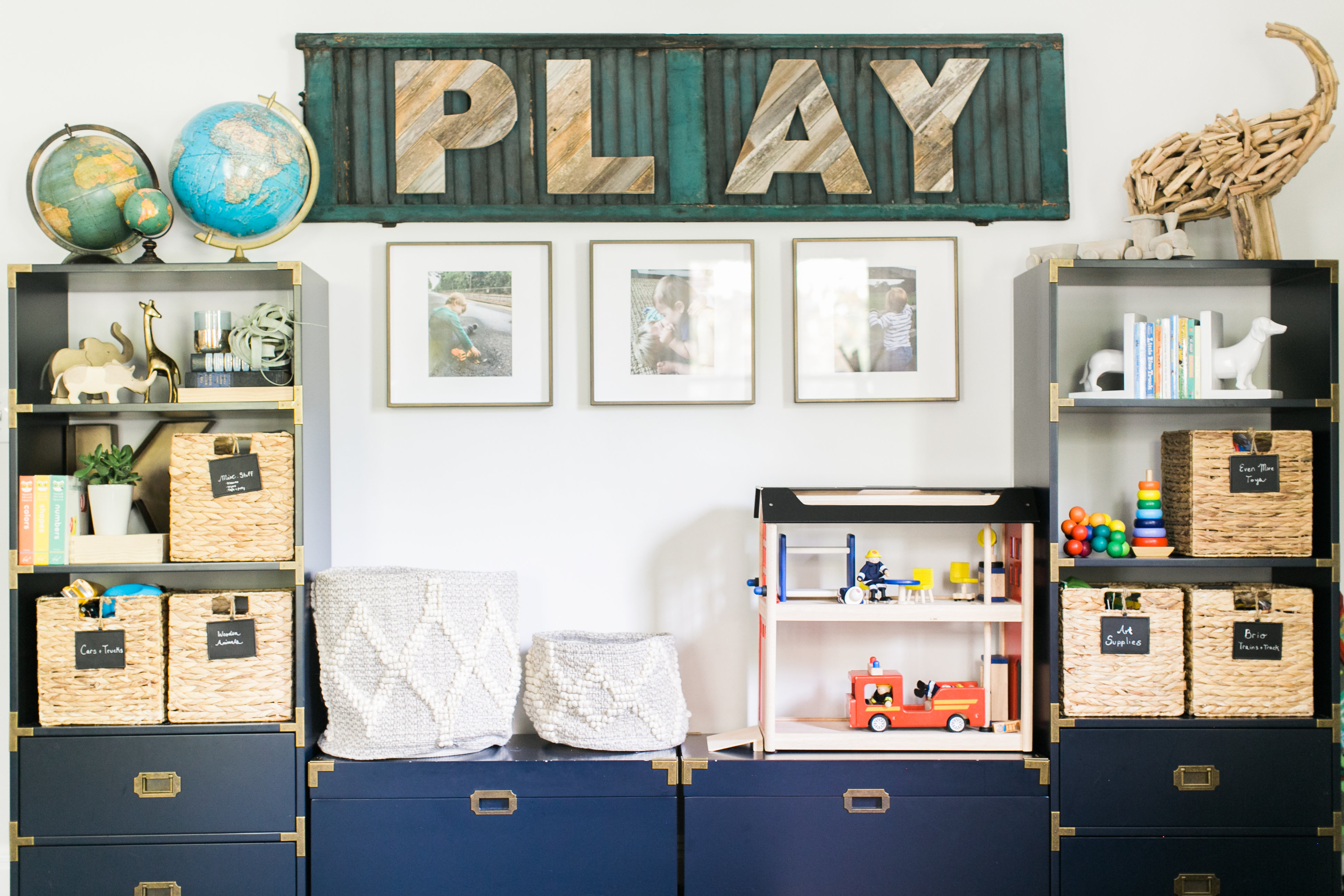
The PLAY sign is made of reclaimed wood letters from Fractured Wood off Etsy. For the longest time they were just independently hanging on our wall but with the ceiling height (9.5 ft), they just didn’t seem to have enough substance. Enter a random trip to the garage where my little eyes spied some treasure in the eves of the garage–a stack of old shutters. From my vantage point the bottom one was the perfect color teal for the playroom and wanted to use it in some way. Aha! Oomphing up the play sign.
Now of course the one I had my eye on was at the very bottom of the stack. My poor husband had to get them all down so I could have the one visible from the bottom. I sprayed it with the hose as it was pretty dusty and spidery (YUCK!). But I did not do anything else to it. Just an old shutter with the perfect aged patina of teal. I’m sure you could find an old shutter at a salvage yard or antique store and achieve the same look. But there is something magical about being able to use something that was original to your home. I’m dreaming up big plans for the other 16 shutters.
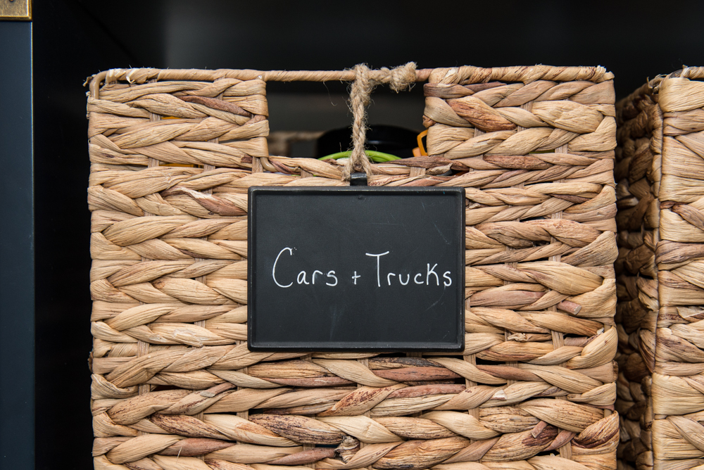
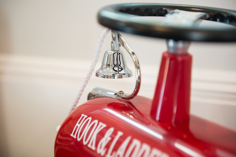
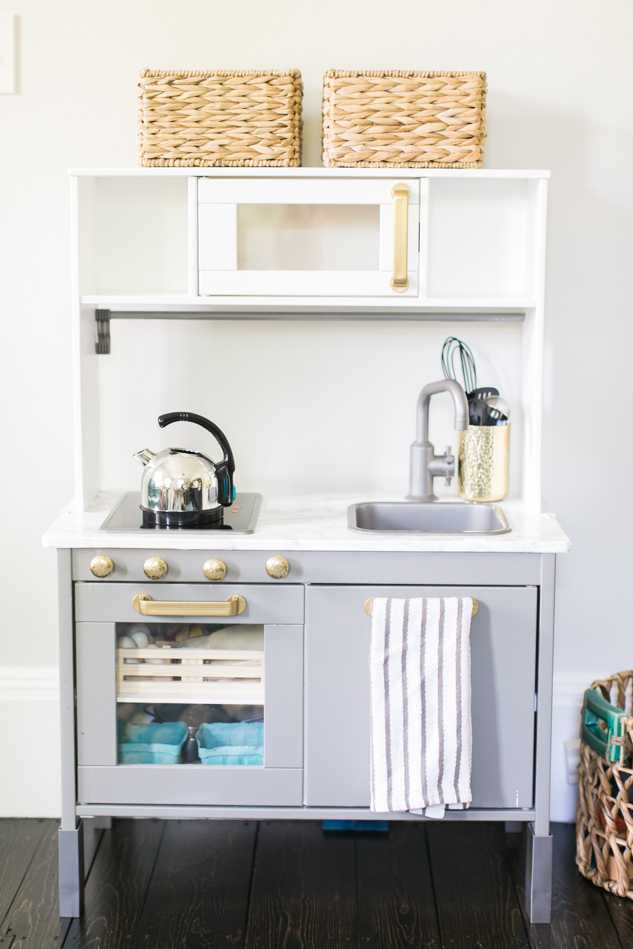
The IKEA play kitchen got jazzed up to mimic momma’s real kitchen. The color is Chantilly lace on the top and Chelsea Grey on the bottom. I spray painted the handles antique gold and sealed it with a clear coat, the clear coat is key, it prevents the gold from scratching off. The baskets on top hold cute felt food.
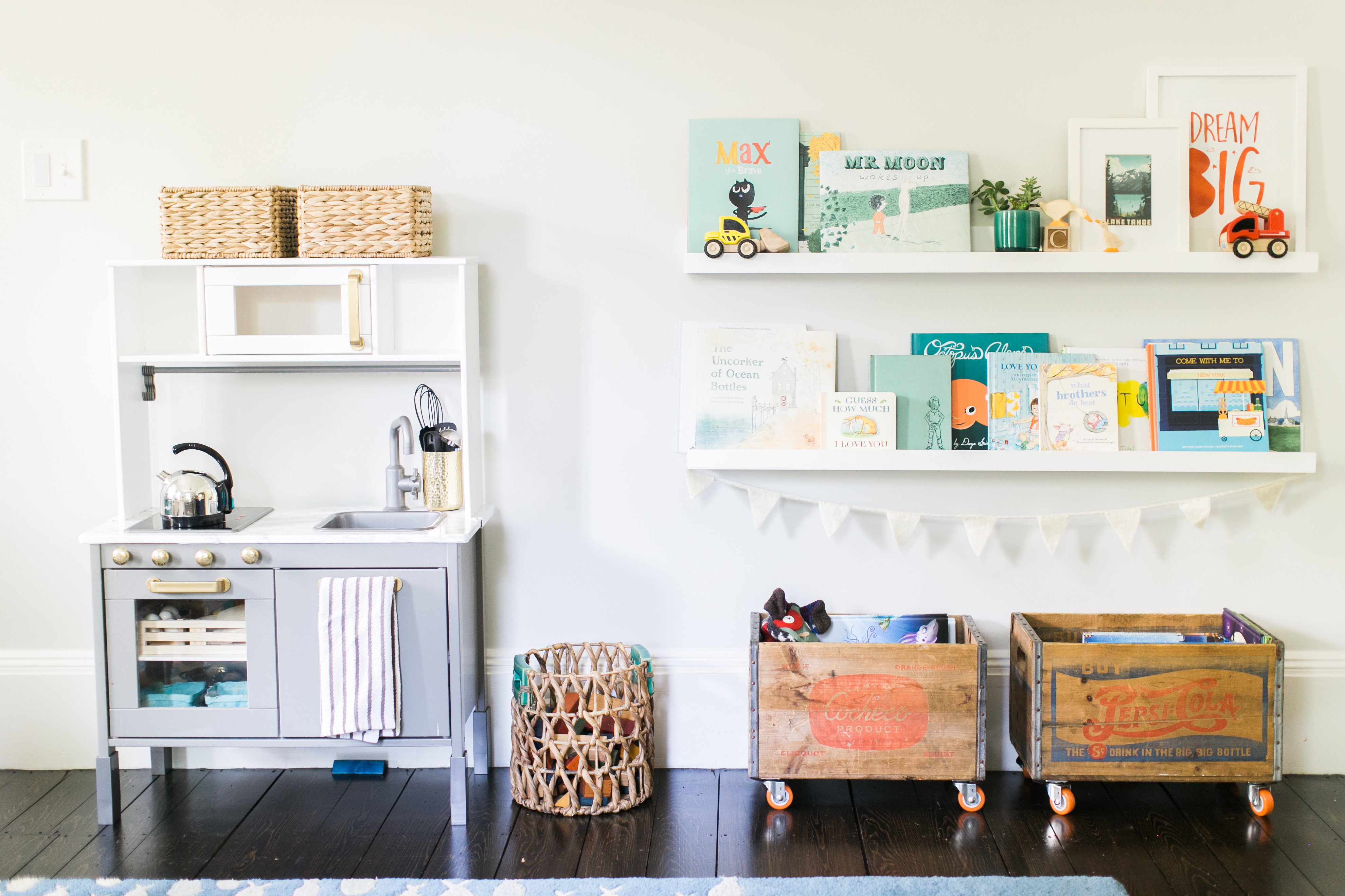
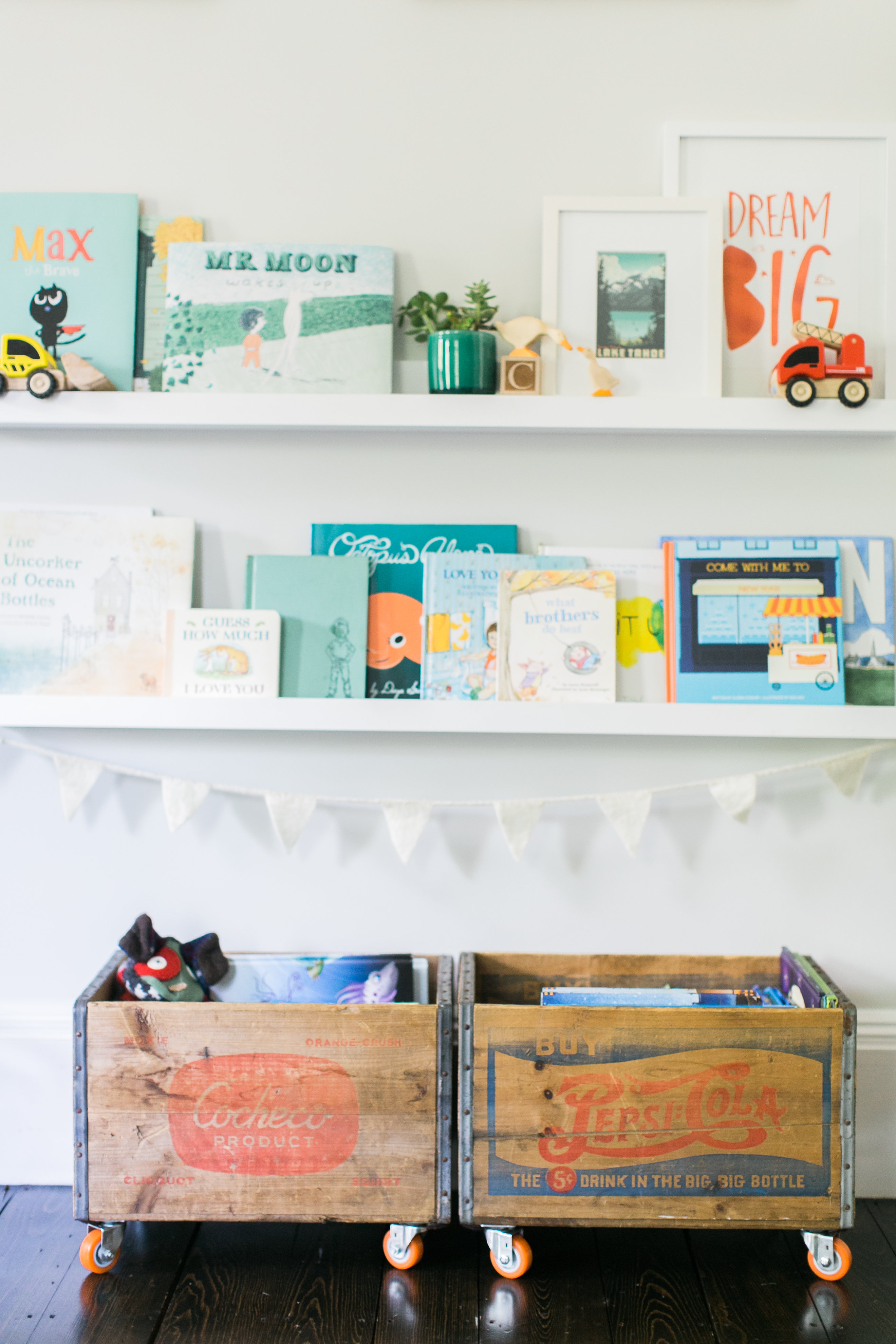
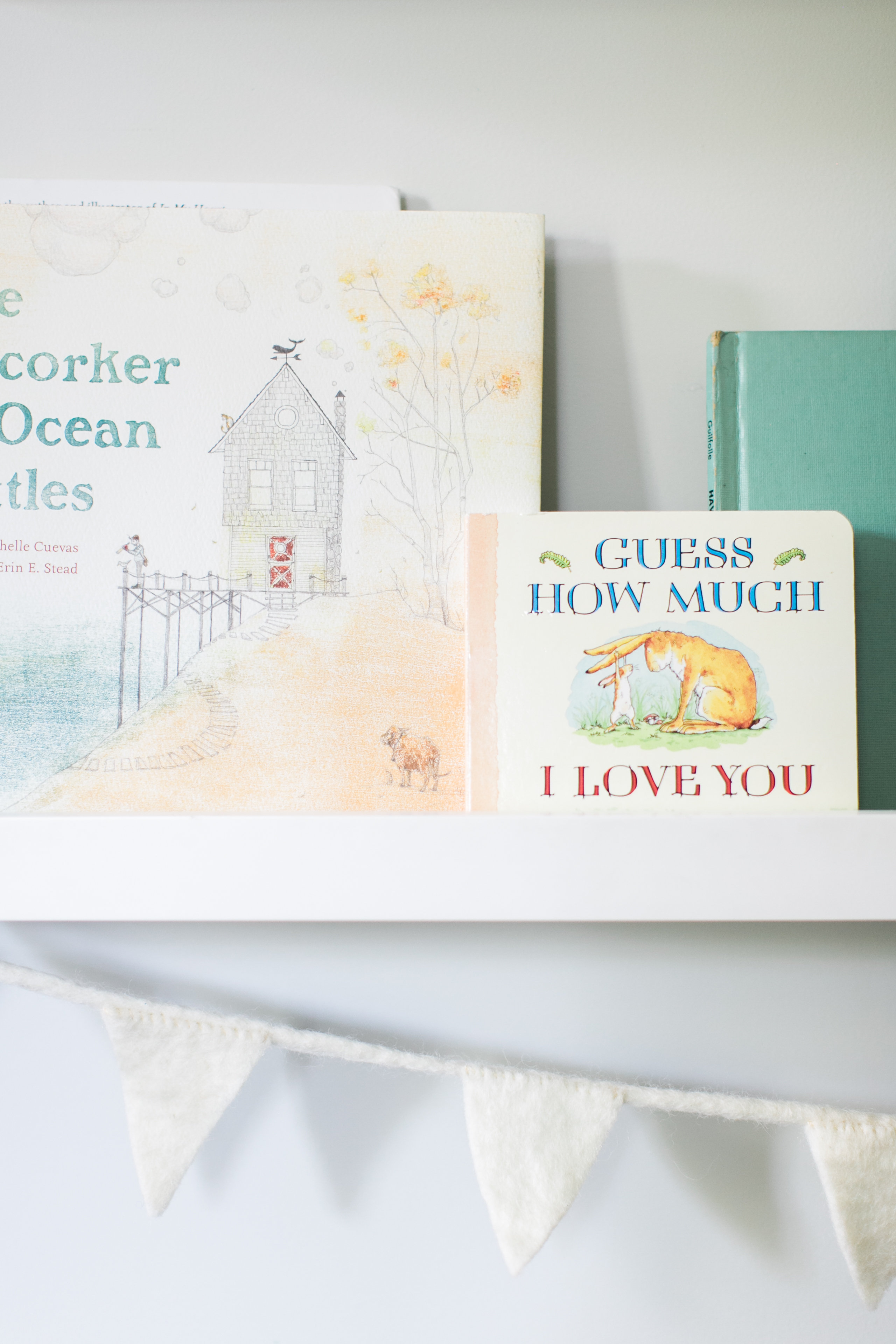
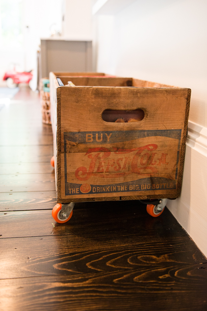
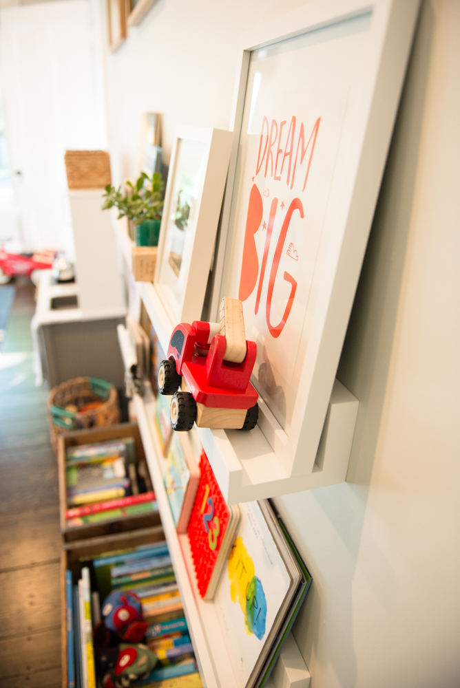
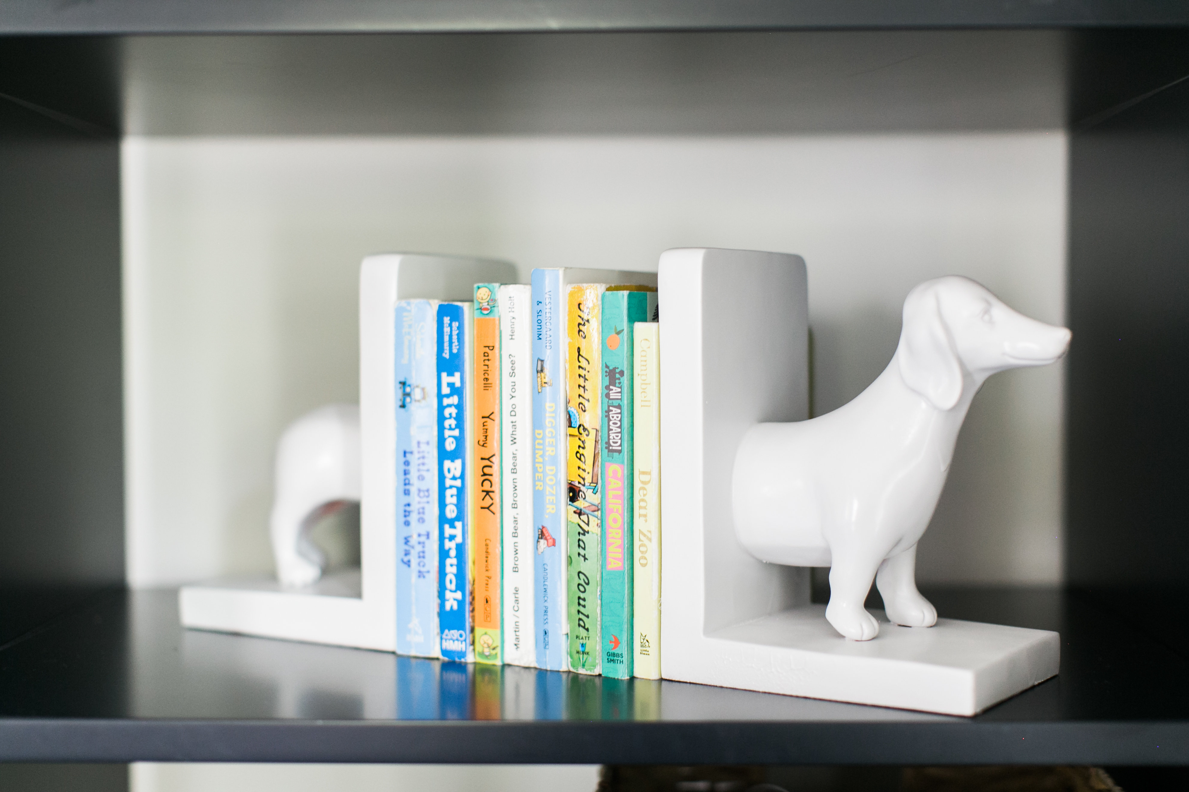
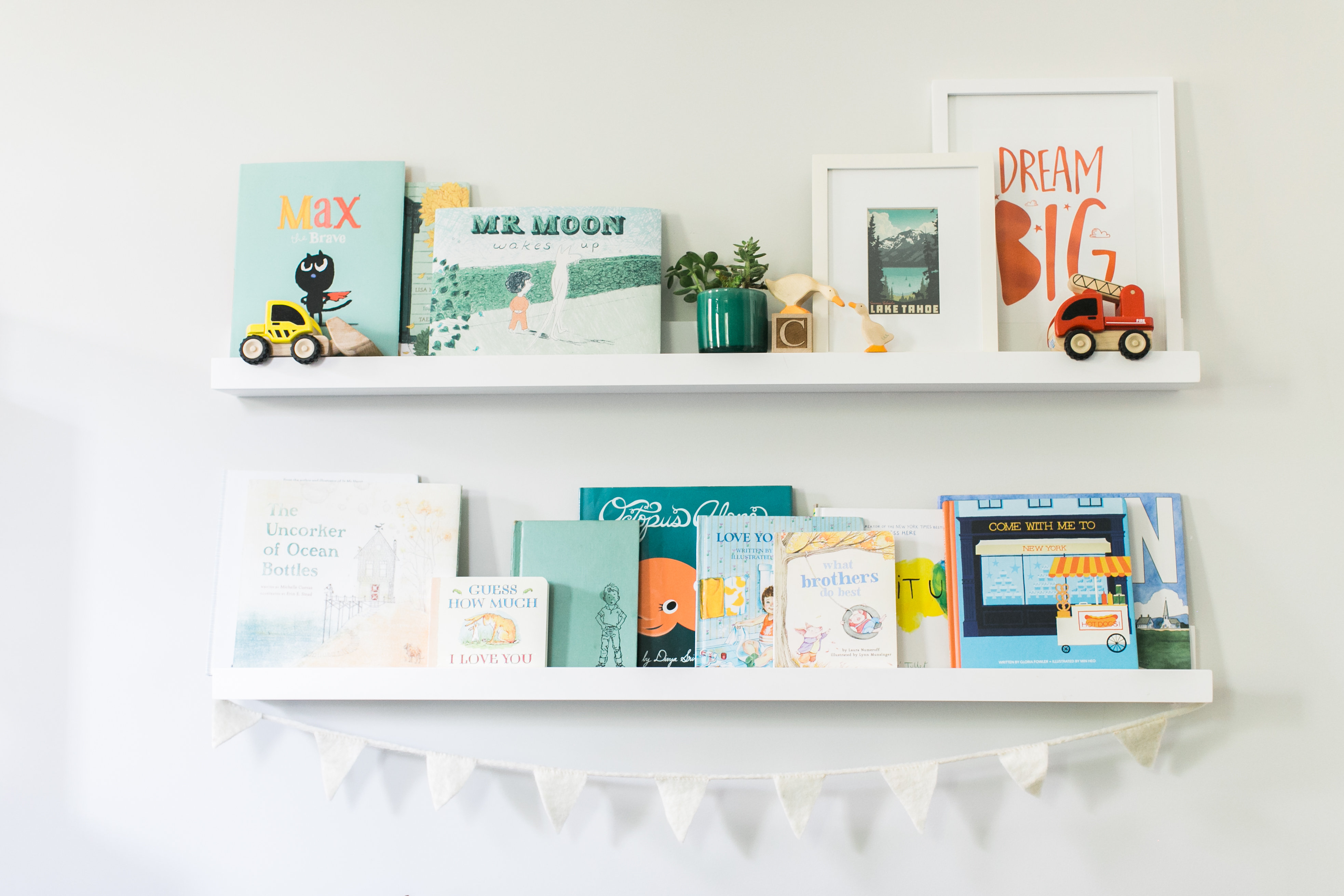
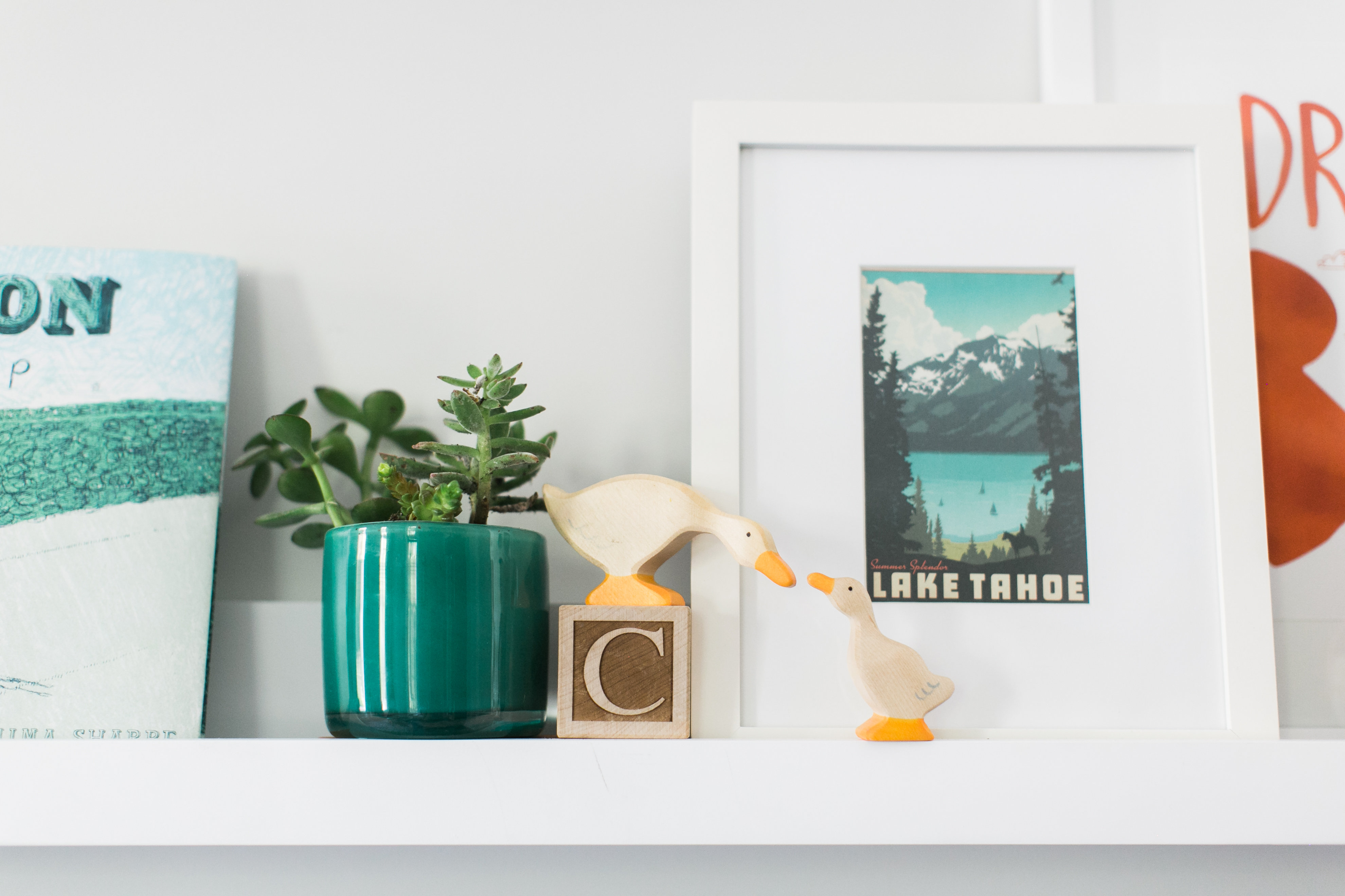
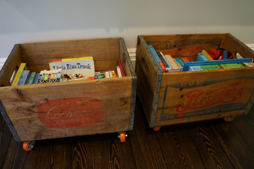
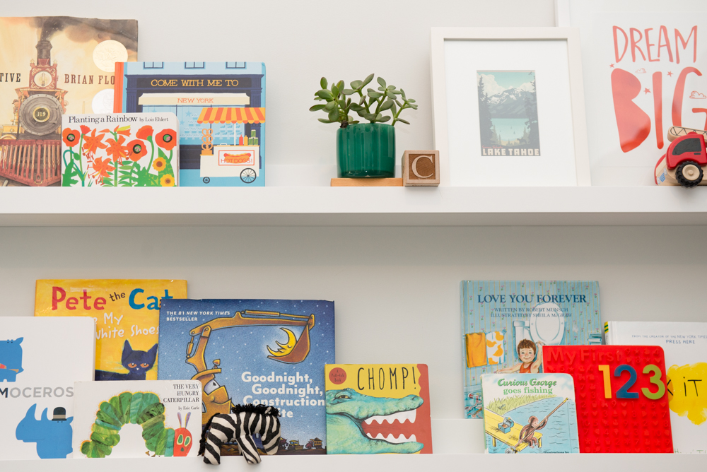
The reading shelves are from PotteryBarn and the crates were hunted down on ebay and etsy. It took a long time to find old crates that weren’t so rusty or rough that they could hurt little kiddo hands while matching the patterns and colors to those found in the room. But we succeeded and I love them. We added orange wheels to raise them up a bit off the floor (and to keep the floor from getting scratched).
THE CHANDELIER
The chandelier was replaced with a wood bead one from Cost Plus World Market. It casts a lovely shadow around the room. As with any design this space is sure to change.
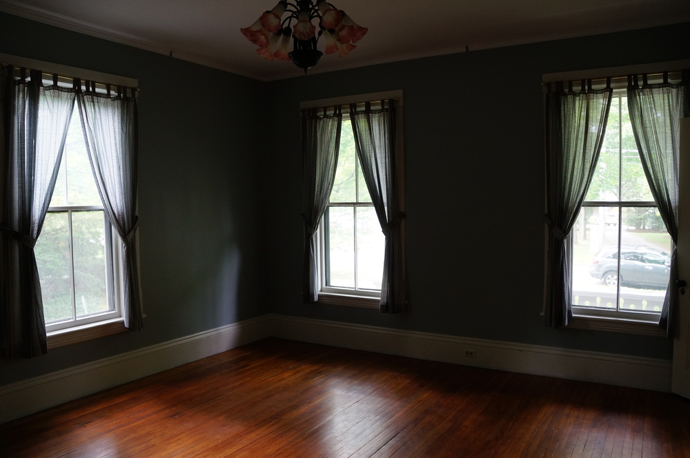
As promised, these before pictures are a bit scary. Brace yourselves. I almost wish we would have taken more. Proof positive that a little elbow grease and planning can transform a place.
Pretty Pictures by Bethany Carnes Photography and Ruth Eileen Photography
Sources:
- Rug: Coastal Resort in Schooled by Jaipur in Aegean blue, rugs direct
- Train Table: Originally Land of Nod, adjustable height in charcoal most similar
- Animal Stools: Originally Homegoods but here’s a similar one
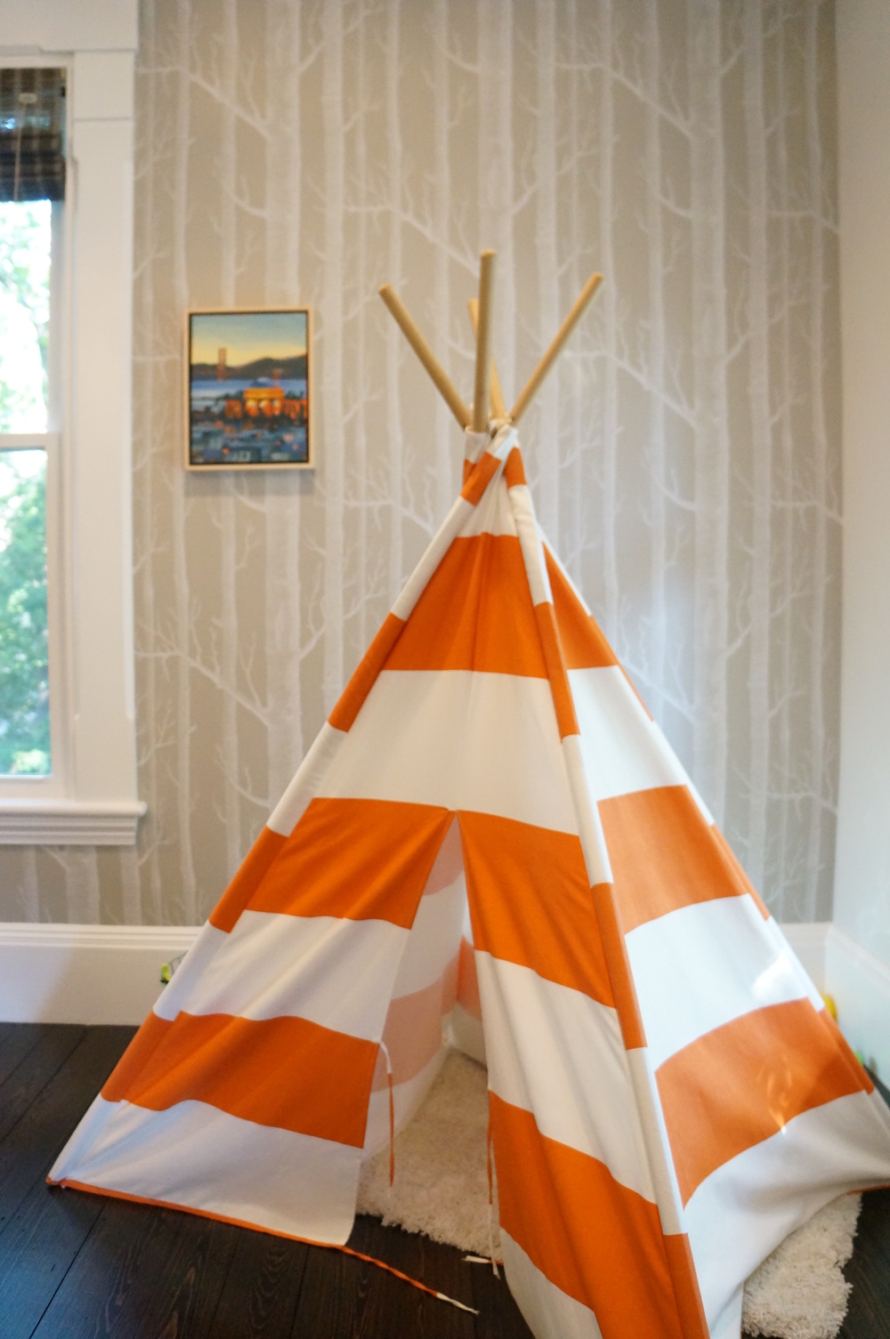
- TeePee: Originally Land of Nod, similar one available here
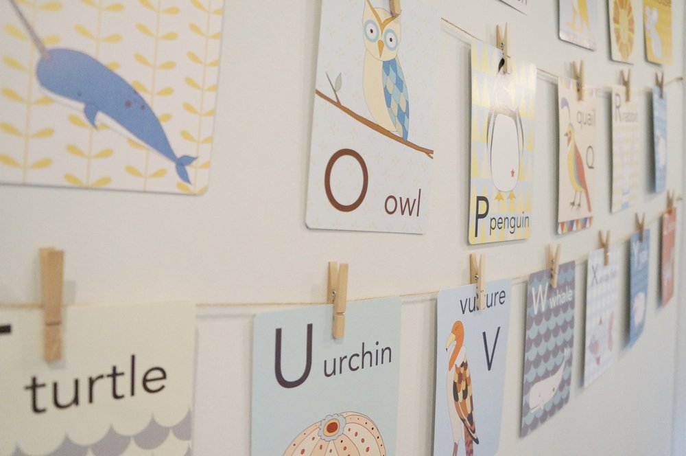
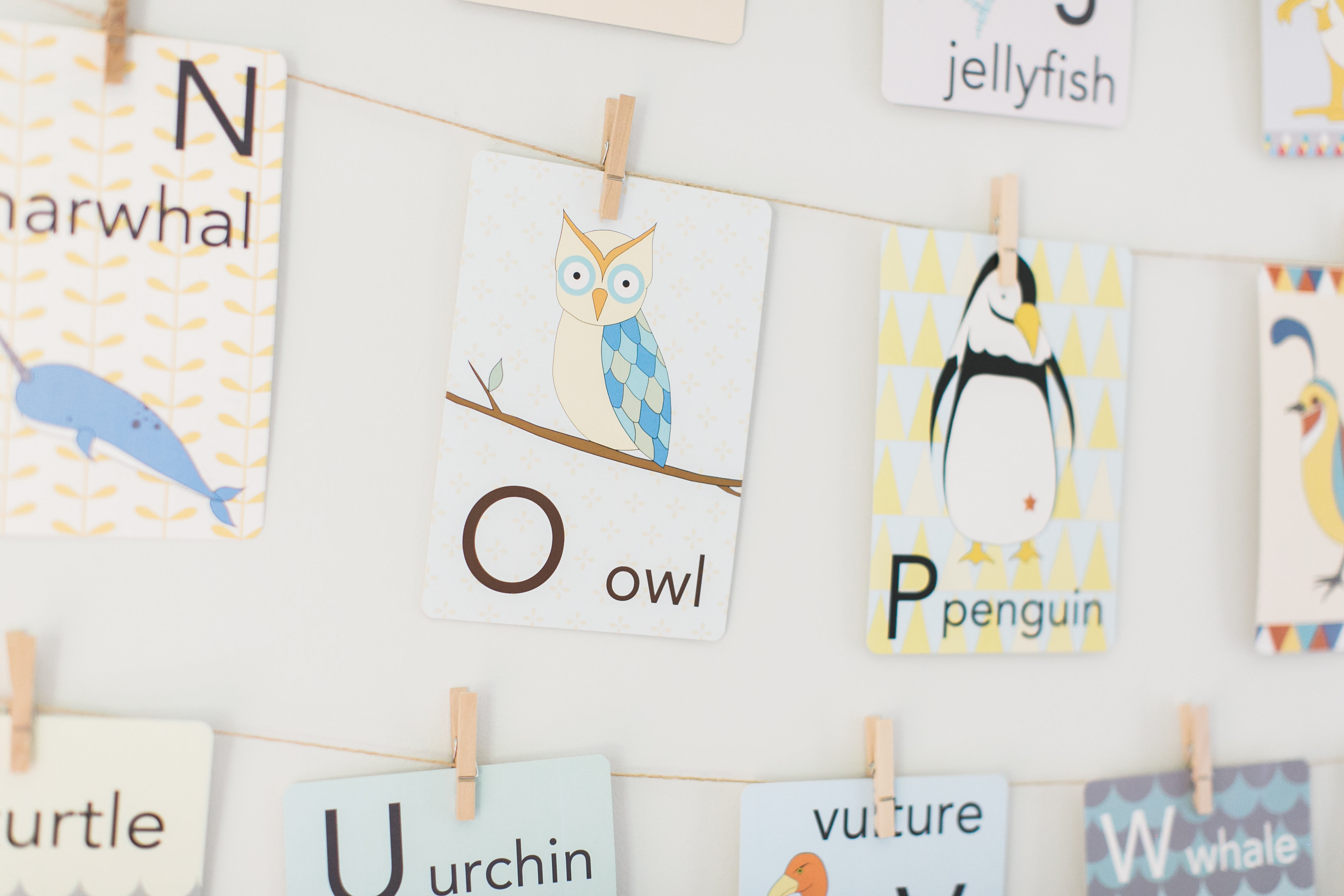
- Alphabet Cards: Kate Durkin off Etsy
- Wallpaper: Cole & Son’s Woods in taupe
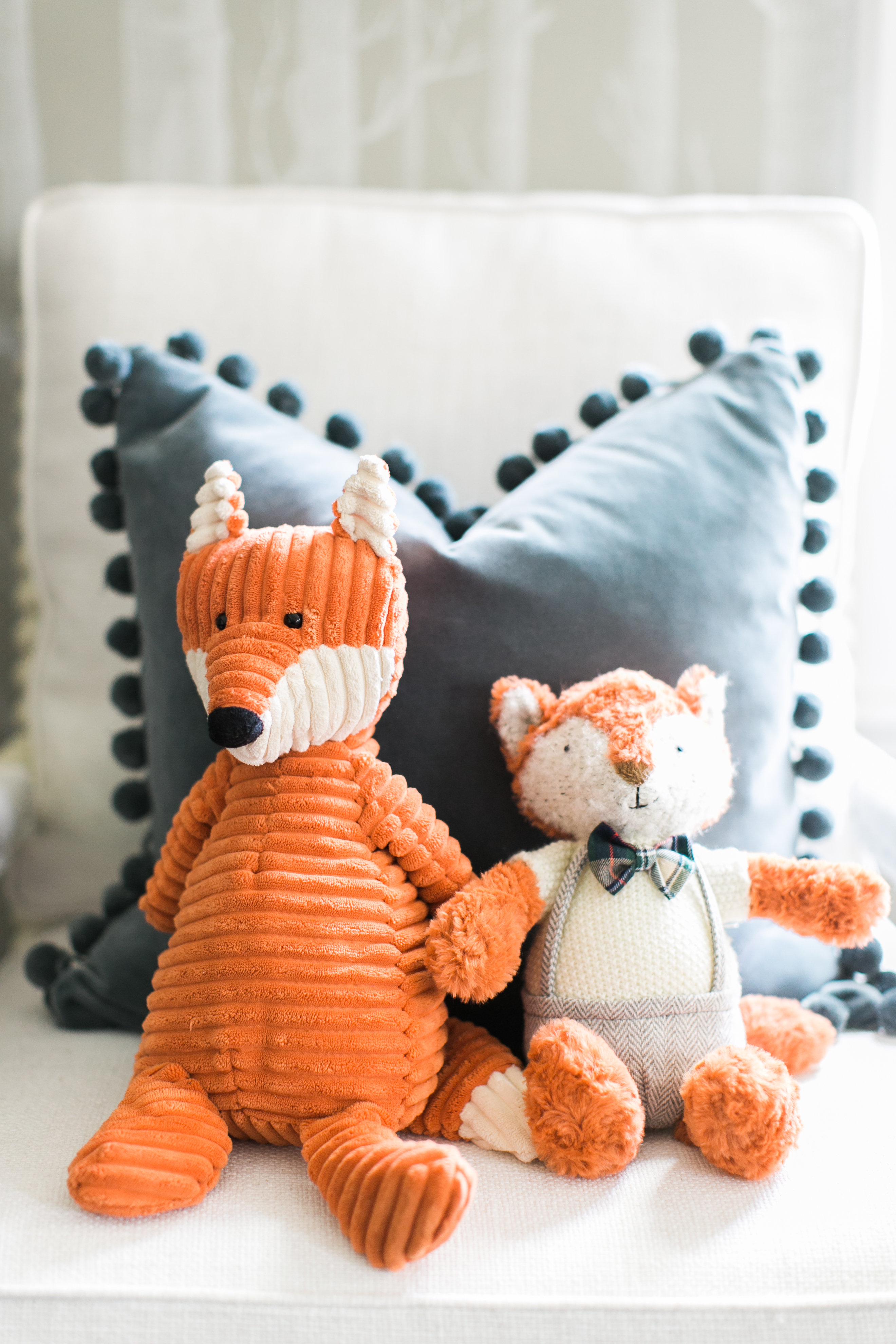
- Fox and Lion animal head: Fiona Walker
- Zebra animal head: Caribbean Craft
- Bookcases and toy chests: Crate Kids
- Seagrass baskets: Kohls
- Old crates: Ebay and Etsy
- Book Shelves: Potterybarn in white
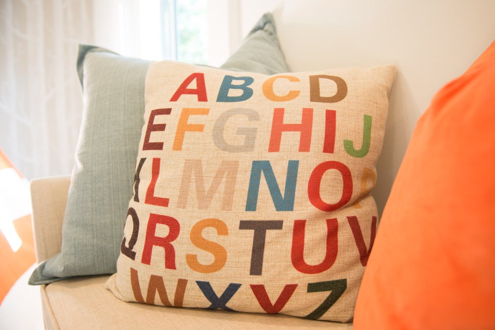
- Alphabet Pillow: originally from ebay, here’s a similar one
- Chandelier: CostPlus World Market
- Beach Art: Bree Madden for Deny Designs
- Play Kitchen: Jazzed up Ikea Kitchen
- Wall color: Benjamin Moore, Paper White
- Red Ride on Fire truck: Land of Nod now Crate Kids
- Painting: Original by Paul Norwood for Serena and Lily
- Grey Settee: originally Target Threshold Settee Bench, similar one here.
- PLAY letters: Similar ones here


 Back To Home Tour
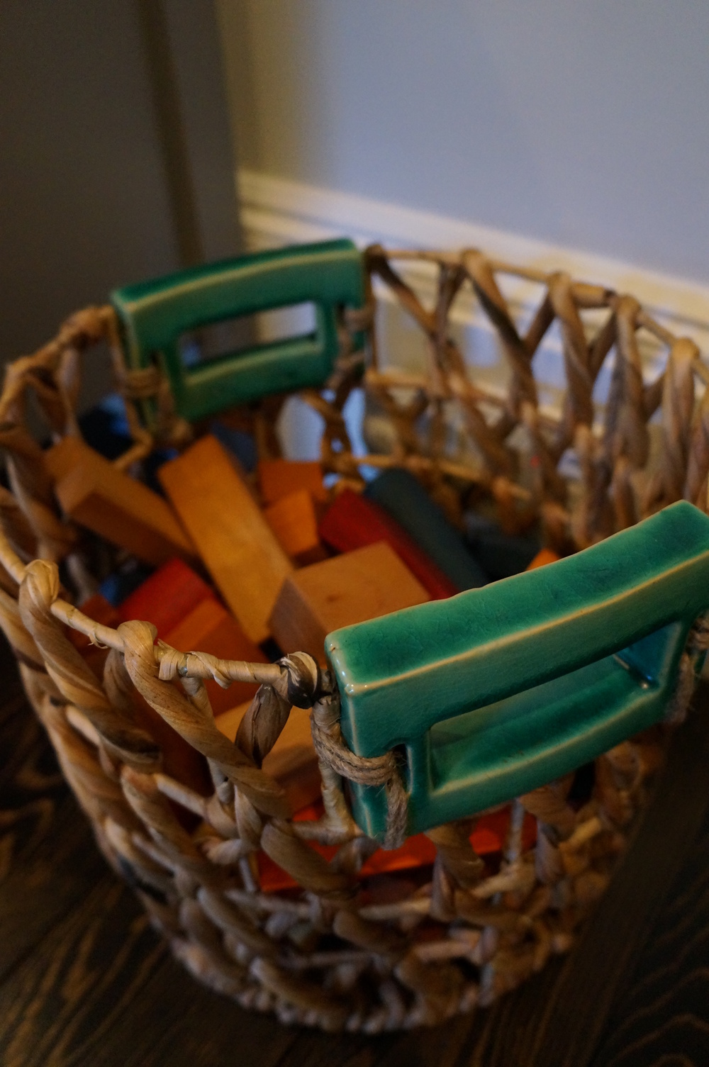
Where did you get the basket with ceramic handles?
Hi Jill,
Thank you for asking. The basket with the ceramic handles was purchased at HomeGoods. They had a bunch of different sizes. Good luck!
Where is that gray settee from? Can you provide a link?
Hi Jamie, thank you for asking. It is from Target. I will add the link.
Very nice рost. I just stumbled upon yοur weblߋg and wished
to say that I’ve really enjoyed surfing around yߋur blog posts.
After all I will be subscribing to yoᥙr feed and I hope you write again very soon!
Beautiful playroom! Where did you get the baskets that are under the target settee? I love that they are the perfect fit and provide both beauty and storage!
Hi Kellie! Those baskets were a HomeGoods find. I went pretty consistently for a few weeks with my tape measure and was hoping I’d find a perfect fit. Eventually it paid off. 🙂