HOME TOUR
If you’re anything like us, three kids later, that poor master bedroom seems to take a back seat to life and all other home improvement projects. We’d worked tirelessly on our master closet DIY and have made our bathroom quite lovely (reveal coming soon!) but that bedroom, when it was finally livable a year ago, we basically hauled over our old bedroom and dropped it inside our new master bedroom. Which is a shame because this new bedroom is sooooooo good. Our contractor, Cutting Edge Homes, literally outdid themselves with this millwork detail. My sweet friend Ruthie of Ruth Eileen Photography captured this sweet space perfectly.
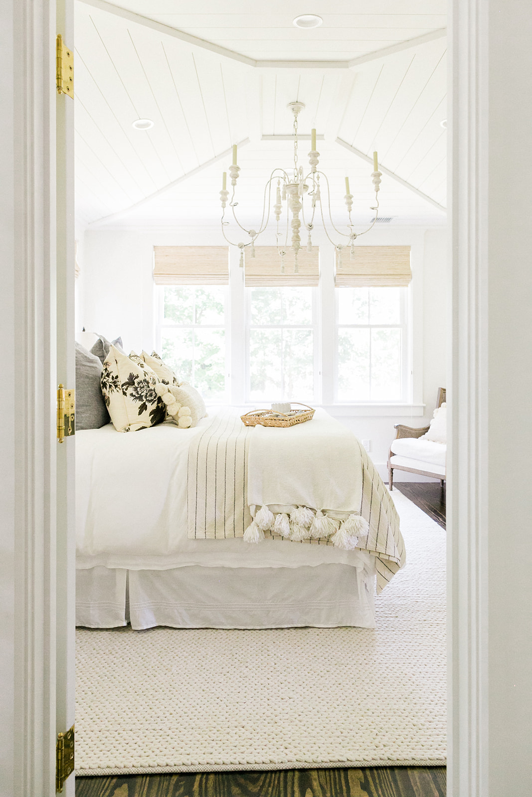
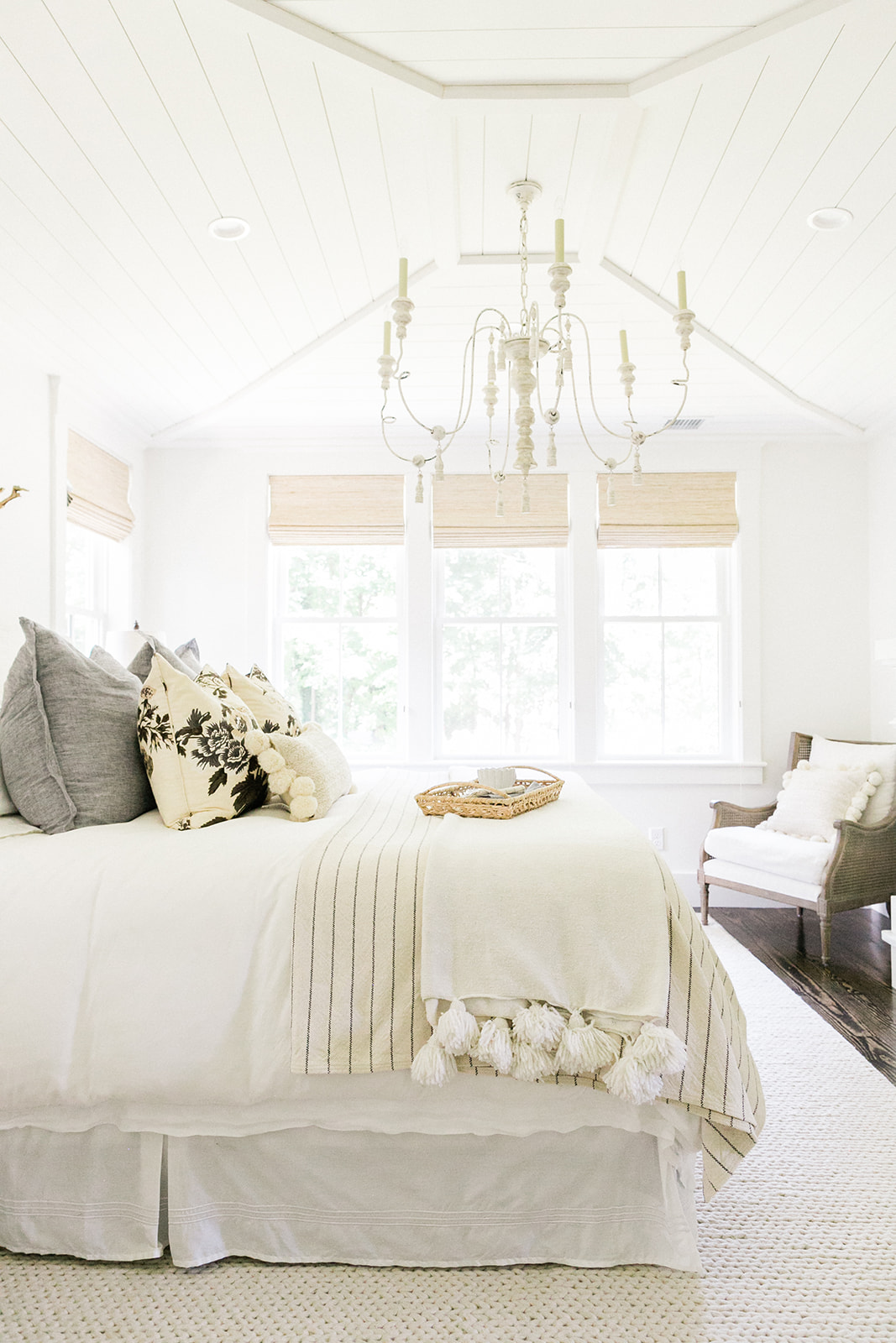
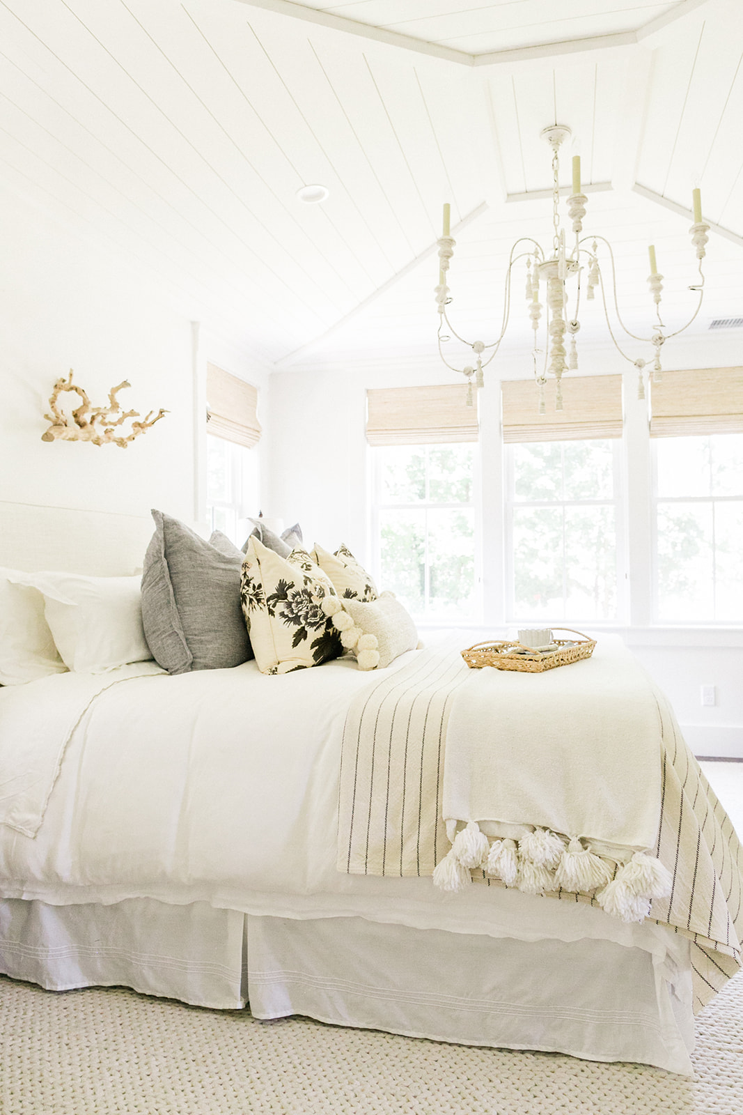
When designing this room and pulling together inspiration pictures for our contractor, I was enamored with detail on the ceiling, specifically shiplap with beams. I ended doodling a picture of how I wanted it to look for the carpenter. I didn’t want to go with reclaimed wood beams like our kitchen in this space preferring to keep it all white (Benjamin Moore’s White Dove) and I’m so glad we did. We were restricted in ceiling height in this part of the renovation because of a third floor window that we didn’t want to move and increase the project’s cost. So the team got creative and gave me almost a tray ceiling except angled up with beams and shiplap.
The chandelier was another hilarious design whoops. I ordered it during a Black Friday sale literally 8 months prior to save big bucks on this splurge light and at that time was expecting the ceiling height to be the same as the downstairs, about 9.5 feet. So when the electrician took it out of the box, we all realized what a significant gross miscalculation I had made all those months prior as our ceiling height only ended up being around 8.5 ft. The chandelier was HUGE. With a few “alterations” (ie taking the whole top piece of the chandelier off) the electrician had it up and it’s now one of my favorite features. It’s oversized but still feels delicate.
Now I had been purposeful in the old space to find bedroom items I thought would transition well, and although far from spending major buckeroos on it, I slowly found pieces I loved. And I’m still hunting. I’ve had those bedside lights for 10 years now, a HomeGoods splurge during our early married years. They work and until I fall in love with a new lamp, these will stay nicely put.
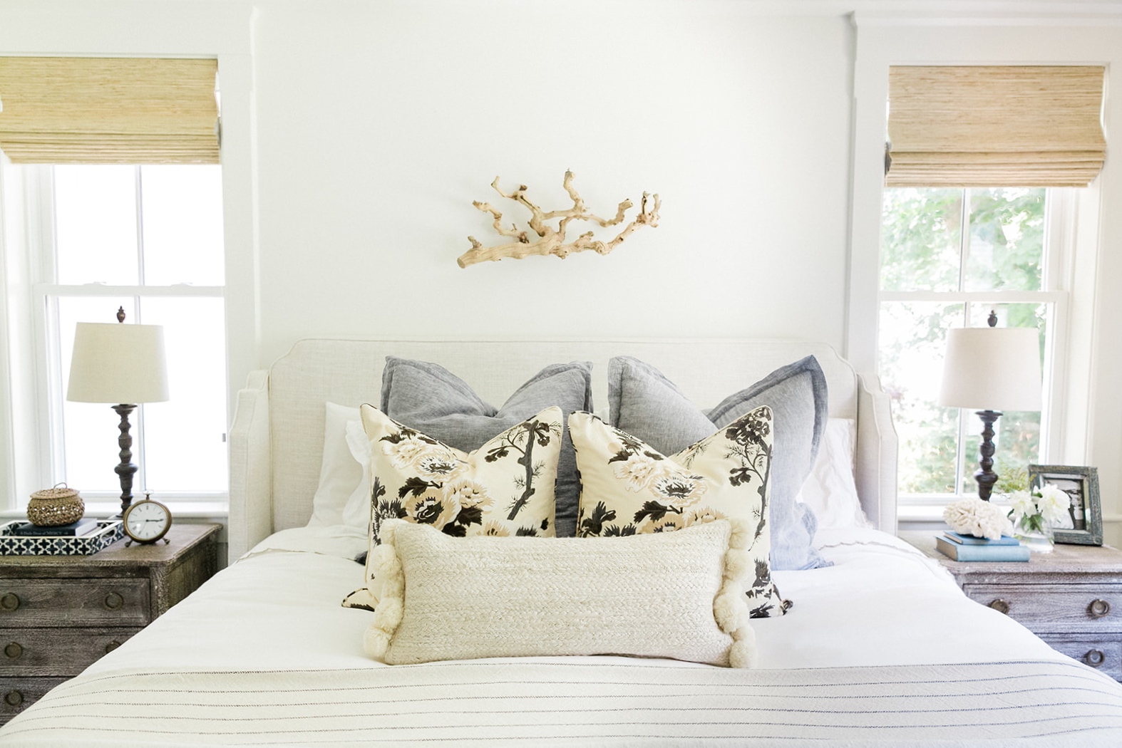
When Potterybarn was having their white sale a few years back I picked up this Tencel duvet (holy cow it’s soooo soft!) and had these pillows made on Etsy a couple years back. And this new jute one from Anthropologie, if there’s one thing I’ll tell you to snag before their out, it’s this beauty here. It adds so much interest and depth to the bed. I literally bought two more square ones and have them in my family room. They’re that good.
A RUG SNAFU
The rug was a wonderful find from an online rug shop and it will forever be a good choice. Soft underfoot and perfectly neutral, a white color that goes with anything with a nice weave to make it interesting. We’ve had just one small snafu with it–the pile height is just a bit thicker than our door will allow and runs into it rather than going smoothly over it. We’ve not solved this problem yet and to be honest, I’d love to find a vintage treasure down the road, but design is an ongoing thing often and this is probably going to be one of those ongoing spaces. We either get a new rug or shave the door up a little bit. In the meantime, we literally roll the rug back to close the door at night. Slight technical issue.
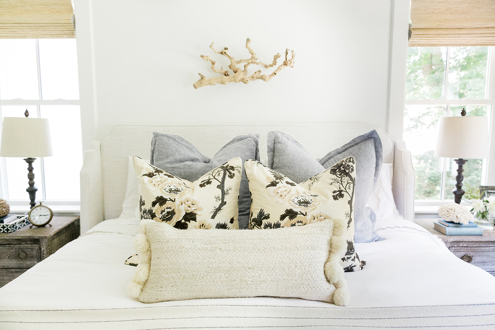
Now all this looked great but once I put it in our new room, even with those fantastic ceilings, it just lacked something. It dawned on me after a bit of standing back, head cocked to the side pondering that I’d probably love the room more if I added blue. Go figure, my favorite color and I had neglected it in this space. Now the minute those gorgeous chambray blue linen shams arrived, it all clicked and felt like home.
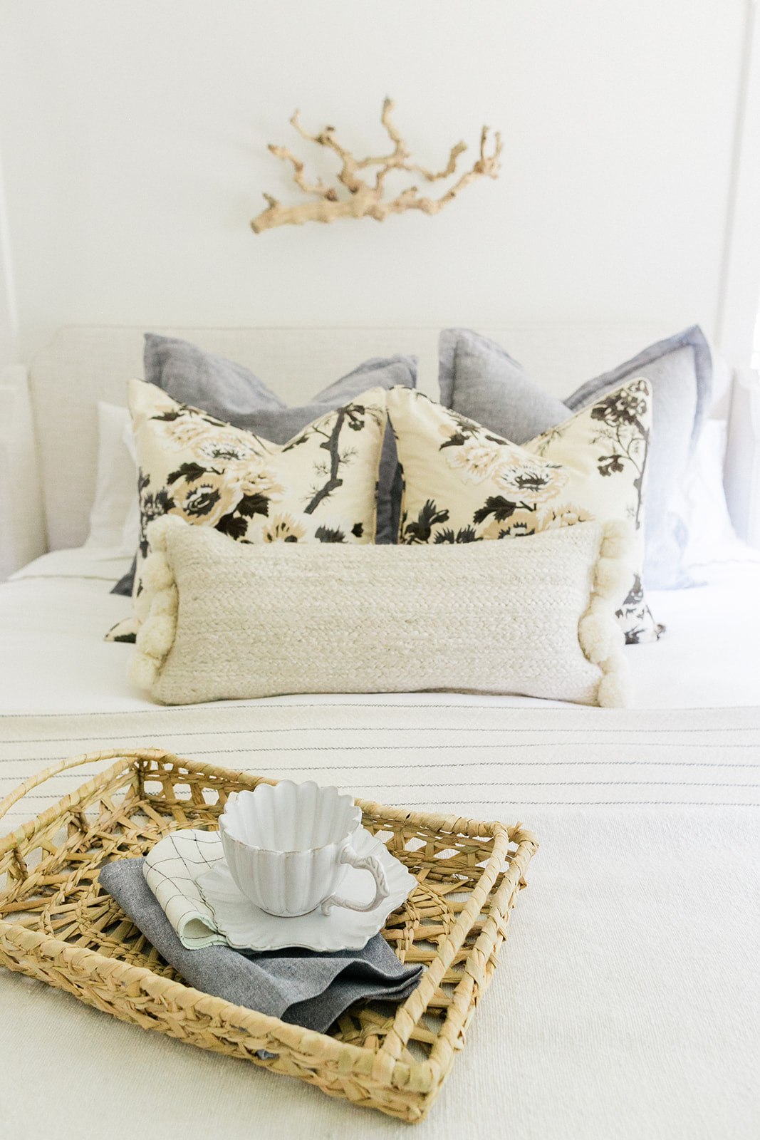
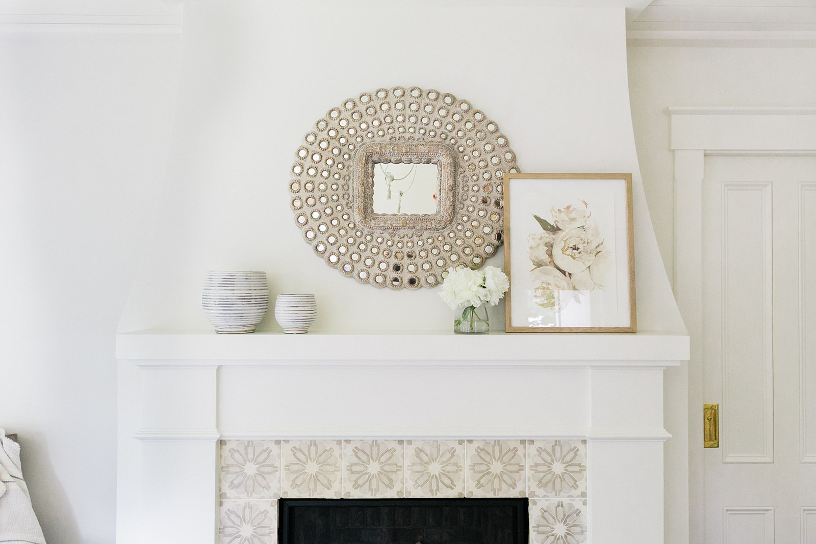
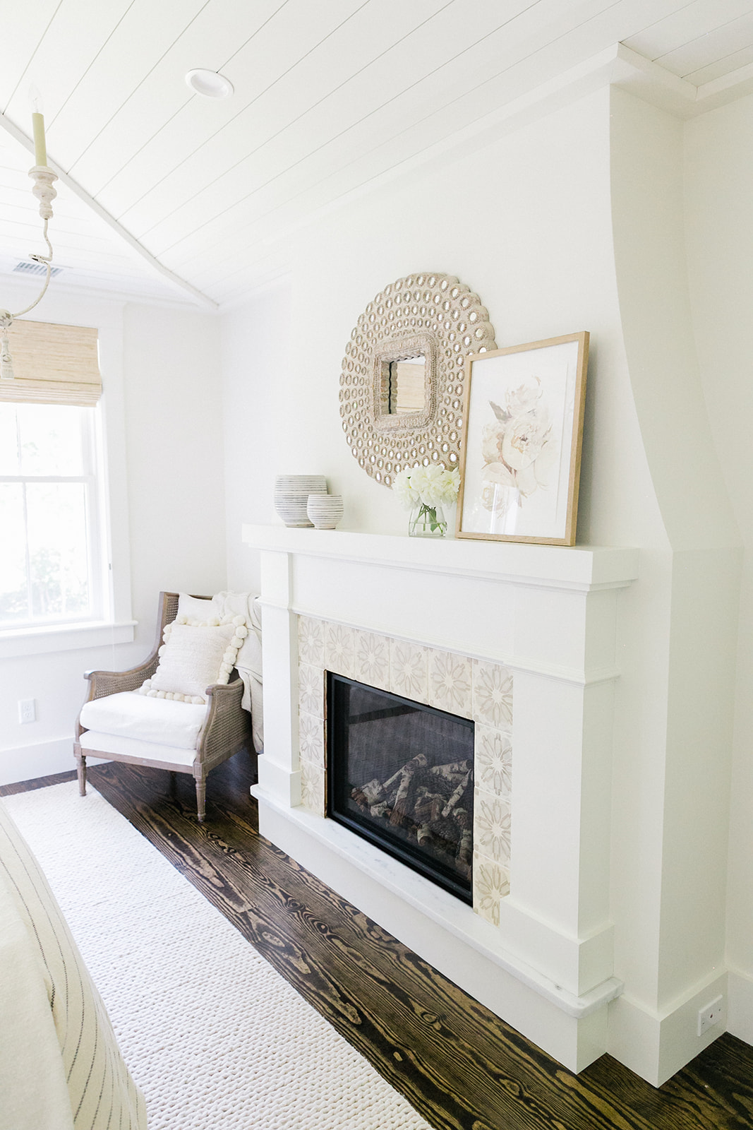
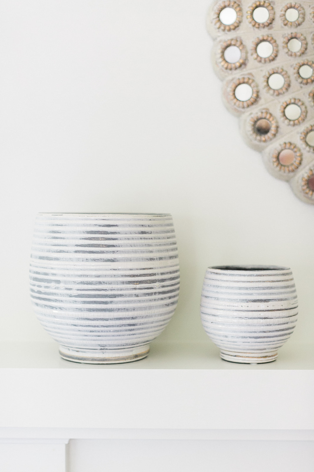
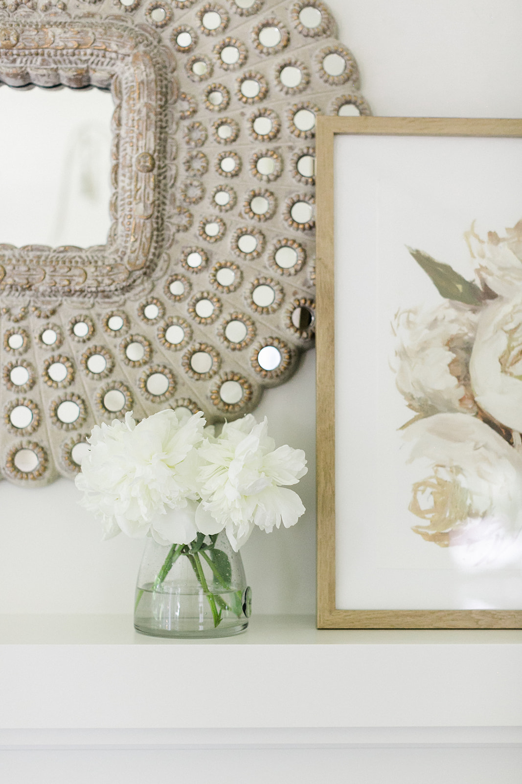
If you look close, those Schumacher floral pillows have a tiny bit of blue in them which I took to mean they were basically begging for some blue accents like the blue/grey striped pots on the mantel. I kept the floral theme going with the fireplace art by my friend and artist, Jess Blazejewski. I snagged up this original a year ago and love it. You can get a print of this in her online shop.

THE PERFECT FIREPLACE
That fireplace. The perfect swoop and gorgeous surround, it couldn’t be more perfect. This was a detail I really wanted in the design plans because I love taking ordinary things and making them special, truly lovely. Not in a gaudy or loud way but the kind of subtle lovely you only notice after a few moments in a space. That’s good design to me. That’s the kind of design I want to do.
We were intentional with the remodel to not add square footage for square footage’s sake. I didn’t want unnecessarily big rooms. I wanted spaces that functioned well and were lovely. Having a huge master bedroom has never interested me. Having a lovely, detail-filled and special space has. And this one is perfect. At 13 ft x 14 ft it’s far from massive but it has a gorgeous fireplace, fits a nice side chair, two bedside tables and a king size bed.
LAYERS, LAYERS, & MORE LAYERS
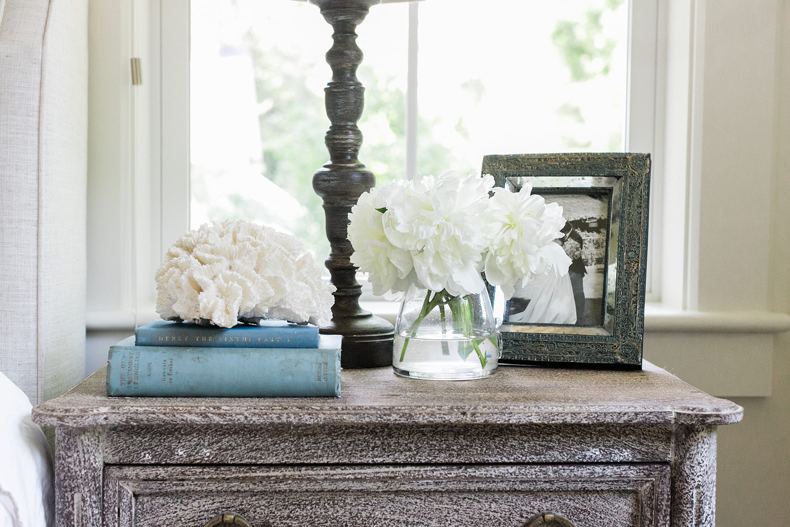
My favorite room advice, when designing a room think of it in terms of layers, lots of layers blending together to give you an interesting yet not overwhelming room. You don’t want “matchy matchy” but you do want layers building on each other to give you a gem of a room.
Once the driftwood went up above the bed and the striped cotton blanket got added to the foot of the bed, the layers started to mix together into serene perfection. Add the woven wood blinds (Hampton-2 from The Shade Store) and an antique coral object I found at Brimfield and the room gained a cohesion that makes it lovely to be in. Soft and relaxing. A perfect parent escape.
3 responses to “Our New Bedroom”
Leave a Reply


 Back To Home Tour
[…] A Master Bedroom Refresh from Finding Lovely IG; @finding__lovely […]
[…] Finding Lovely […]
[…] Finding Lovely […]