HOME TOUR
It’s started! Our Attic Bathroom Addition. When we moved into our historic home 8 years ago, we hit the ground running as I had just found out I was expecting Kai. And with any true fixer upper, every square inch needed work. As a pair of barely 30 year olds, not every dream was in budget. Projects big and small were added to our “someday list.” And we’ve done a great deal to this sweet home. It’s time to cross “add a bathroom to the 3rd floor” off the list. So here are our plans for an attic bathroom addition. Scroll down to vote on which mood board to use!
THE BEFORE
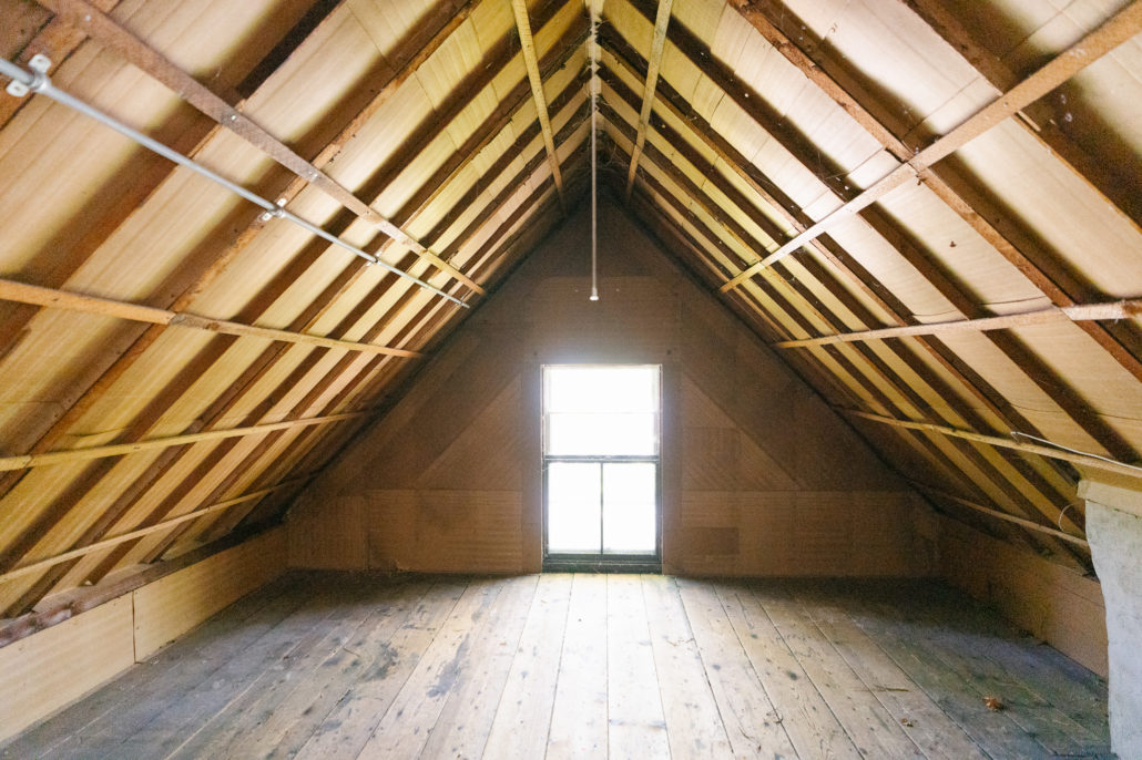
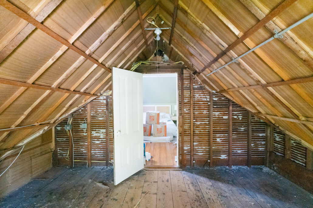
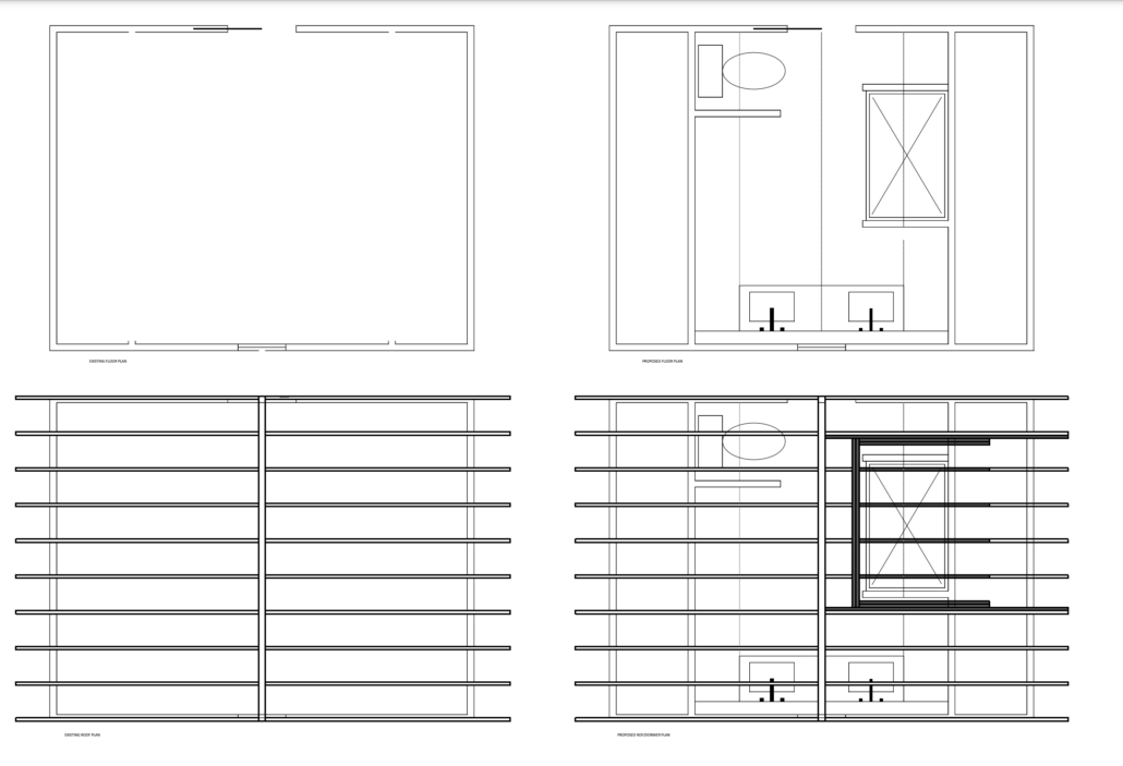
Now this “before” is after we cleared 7 years of clutter out. Our 3rd floor is quite spacious with two big bedrooms, closets, lots of attic space and 9 foot ceilings. Other than interesting slopes to the ceiling, it is far from your traditional attic space, although it does get hot in the summer. However the large storage space off what is our guest room definitely feels like an attic. And that’s exactly where we are adding a full bathroom. The center of this attic space is 9 ft but you can see it slopes dramatically. Hence, some initial floor plan changes.
FLOORPLAN CHANGES
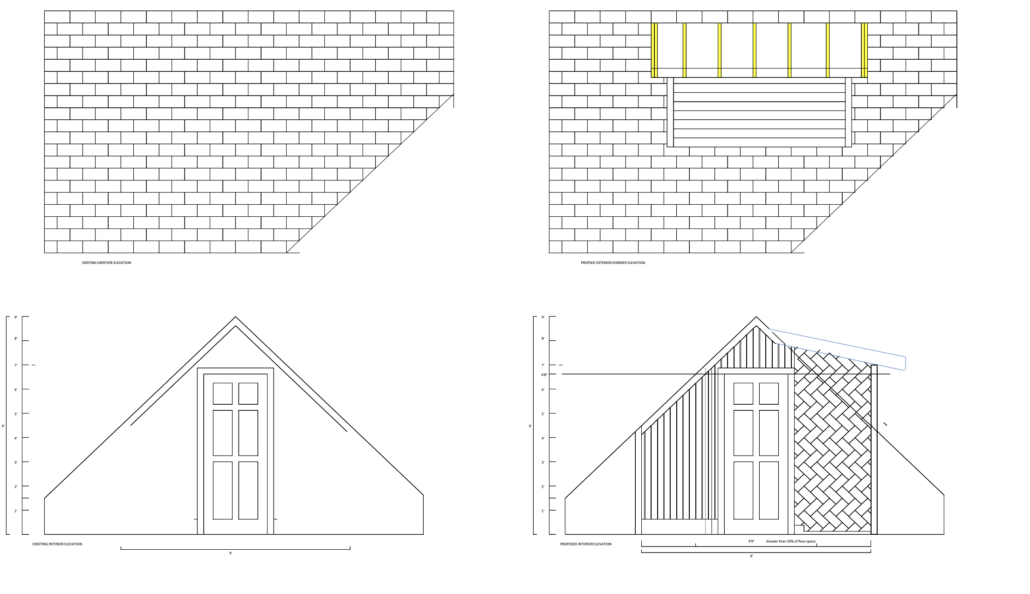
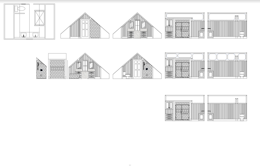
In order to get the permit, we needed to change one aspect to our initial design–a dormer in the shower stall to bring it within code for head height. This added some $$ to the project estimate given a change to our roofline which is a historic slate roof. Not exactly fun but will be a better end result and I’m keeping my eyes fixed firmly on that! It’s an old home and this is an attic, there are bound to be hiccups! You can see the original design ideas below, before the addition of the shower dormer, mainly the detail on the sloped ceiling. The vanity will be different. More on that next.
DESIGN IDEAS
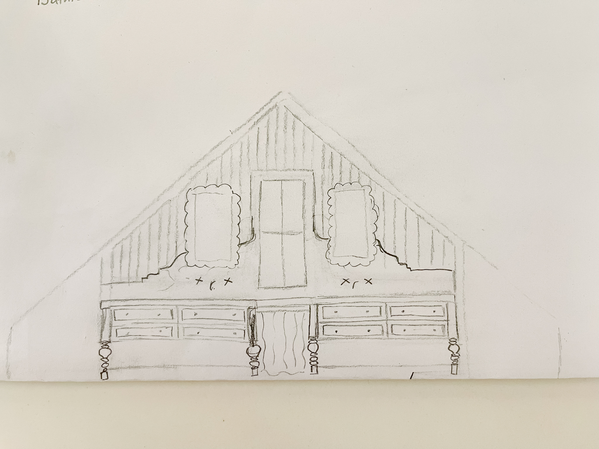
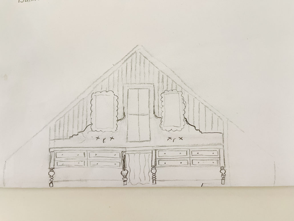
It would have been easier in the overall scheme of things to put the shower in front of the window. This would have nixed the need for the dormer but then the vanity would have been on one of the sides and the mirrors– a challenge to hang with the ceiling slope. From an aesthetic design perspective, I wanted furniture-like vanities and a unique marble wall detail to be the first thing you see. Here’s my drawing to give you an idea of what I am thinking. I make no claims to being an artist.
This was initially drawn with some scalloped mirrors I already have but they are big and won’t likely make the cut, especially because I’m wanting a dark stained wood vanity. Picture a beautifully veined marble counter extending up the wall in an interesting detail with wall mount faucets. Vertical plank on the walls and a lovely cafe curtain in the middle hiding the waste basket and creating a possible makeup spot.
IDEA BOARDS
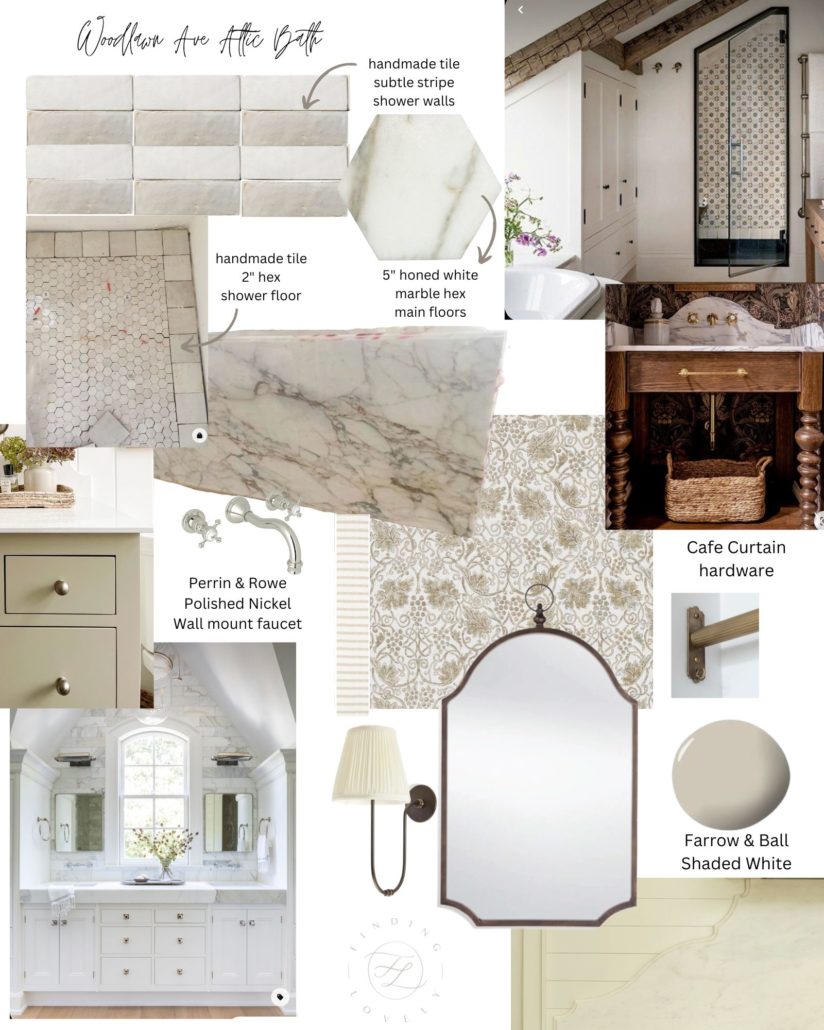
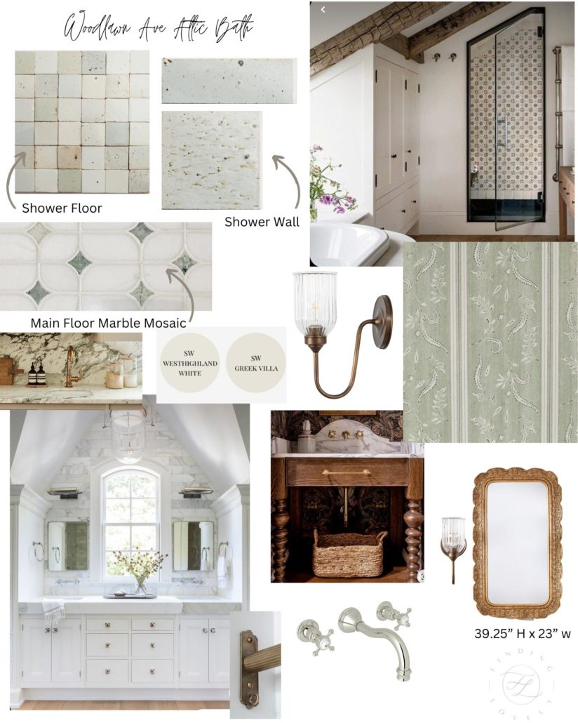
Here are my two ideas. One highlighting a faint robins egg blue/green handmade tile, the other slightly more neutral but unique with a subtle stripe pattern I’ve been dying to do. Give me your two sense. I need to get this tile order in and am doing the whole overthinking thing. Truth be told, when we finish our basement, we’ll be adding another bathroom and I’ll probably just use whichever one I didn’t go with.
OPTION 1
OPTION 2
More loveliness to come! Give me your thoughts on these mood boards below.


 Back To Home Tour