HOME TOUR
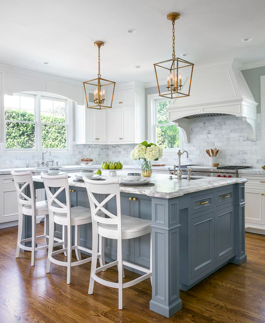
As we wade through the middle of this remodel on our old home, several design questions are coming up and I’m wishing I could find a comprehensive post about them. They probably do exist somewhere but I got impatient picking through unhelpful articles and decided to save you all the sanity if you’re getting ready to design your own kitchen and struggling with the same set of questions. How do you pick a kitchen island style? For me this was really a question about how I wanted my kitchen island to look and function. So I turned to pinterest to find inspiration and really started seeing trends in island design styles.
Here are several kitchen island designs, descriptions and inspiration pictures that would have helped me immensely because sometimes you just need to see a picture to decide. Clearly this is not a complete list nor are these technical names because well, I’m winging it, and frankly this is an evolving, creative field, but these are the designs I was seeing most in kitchens with an island.
1. NO FUSS ISLAND
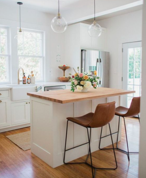
I’m calling this the “no fuss” island because it has clean lines, no corbels or “legs” holding up the counter top material and it doesn’t look like furniture. It’s simple, classic and let’s the other features of your kitchen take center stage. It simply has an overhang of countertop material to make space for you to sit. My husband was all for this style because he doesn’t like to bump his knees into anything.
2. CORBEL ISLAND
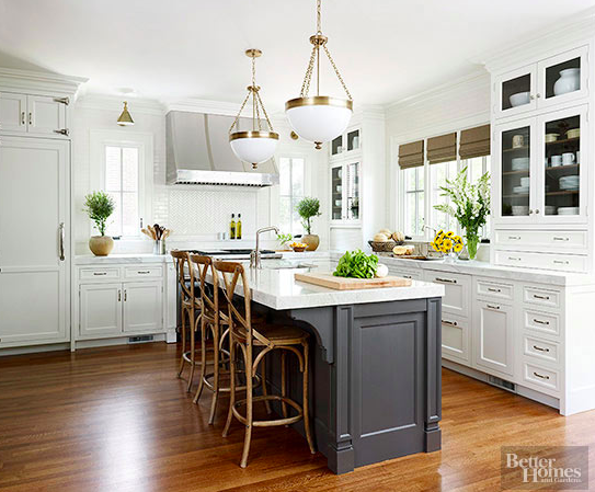
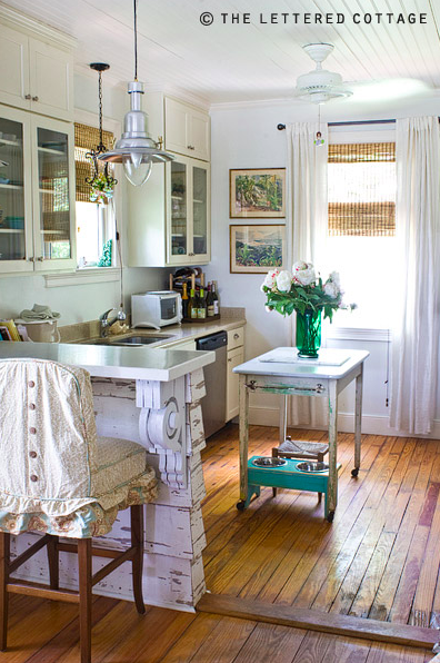
This is similar to the “no fuss” island except the corners, perhaps even the middle of the island depending on it’s size, are held up by corbels. Whether the counter top material is actually held up by the corbels or they serve a decorative roll is the contractor’s job to figure out. The aesthetic is a bit more traditional yet can work in a lot of different kitchen designs. Sometimes you see fancy corbels or vintage finds on the edge like on The Lettered Cottage’s picture below, other times you see a simple design, maybe made of metal, that just adds a little extra pizazz to the island design.
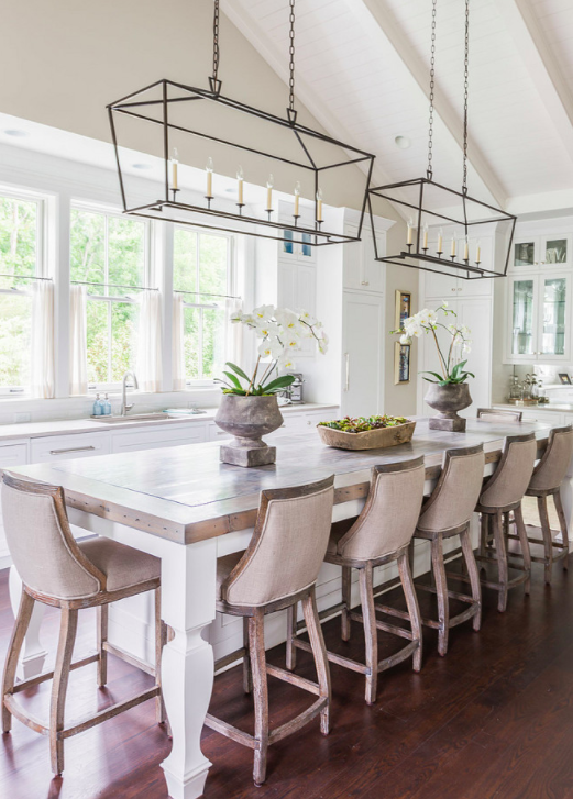
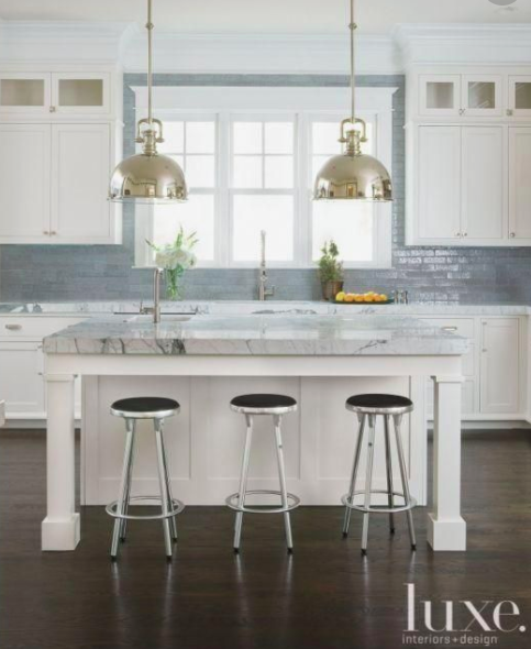
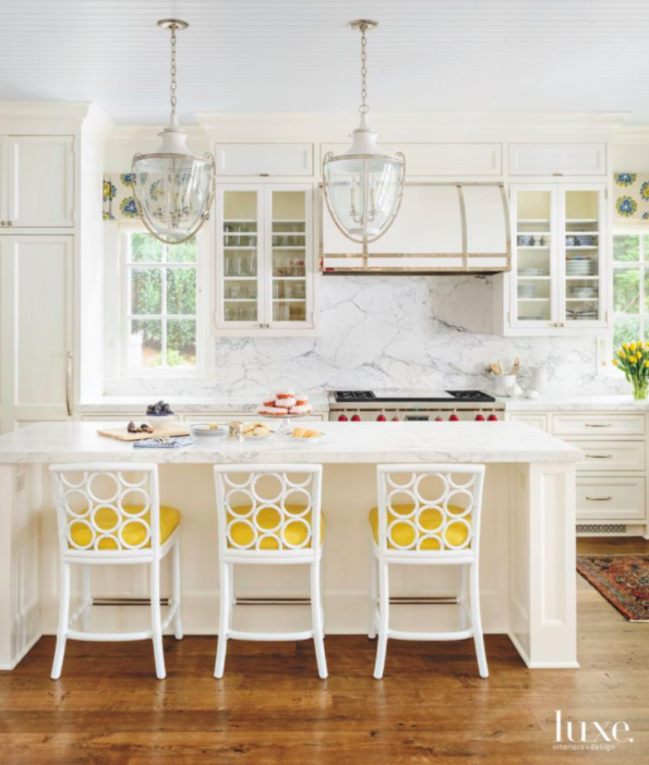
3. OPEN LEG ISLAND
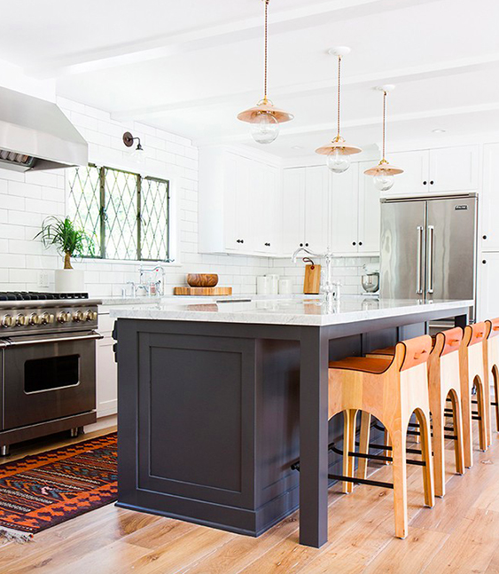
With this style you can have one full depth of cabinetry on one side (like the picture above) or on both sides of the island, double depth (picture below by Christine Sheldon Design) which then makes it a more substantial and an overall wider island. The countertop material extends off one side or up to 3 sides (see the picture below) and is held up by legs. The legs can be simple and straight or more furniture-like in appearance and add a detail to the island that can be nice. I was really leaning this way for our kitchen island design because we’re going to have a unique detail on the inside of the island and I thought some natural light from both sides might be nice to highlight it. I’m still on the fence. Our architect didn’t love it because the depth of our kitchen only allows for cabinets on one side and he felt it made the island look less substantial.

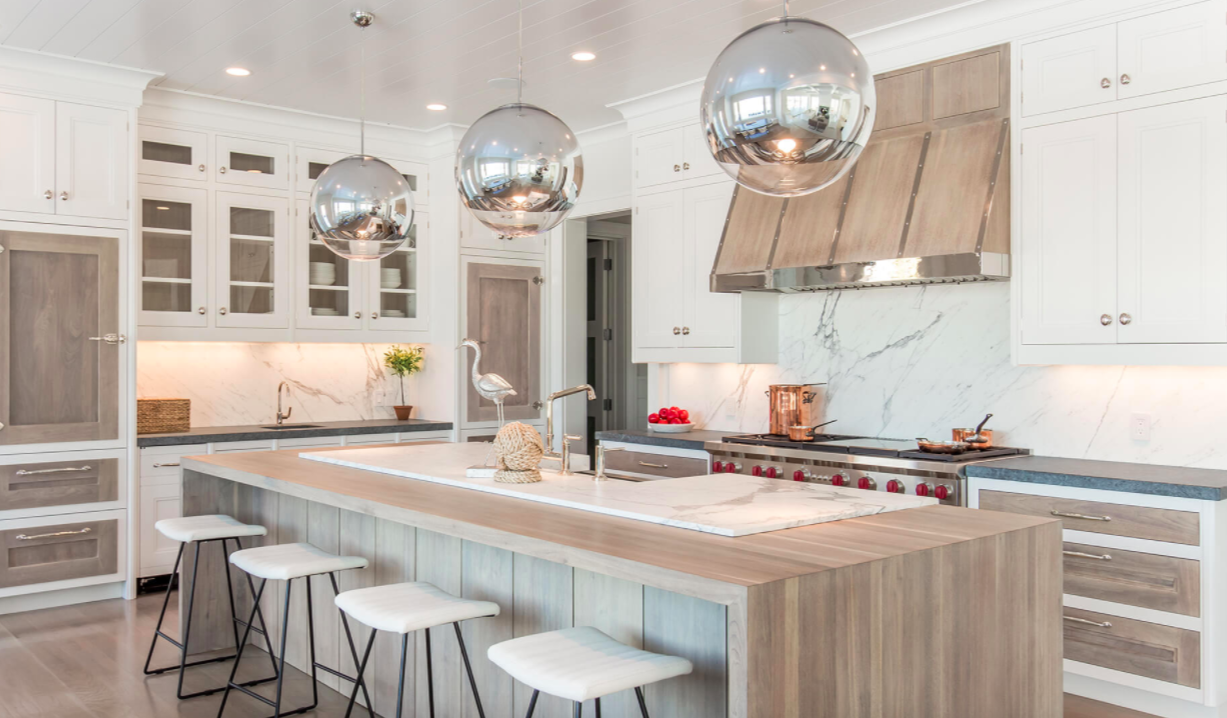
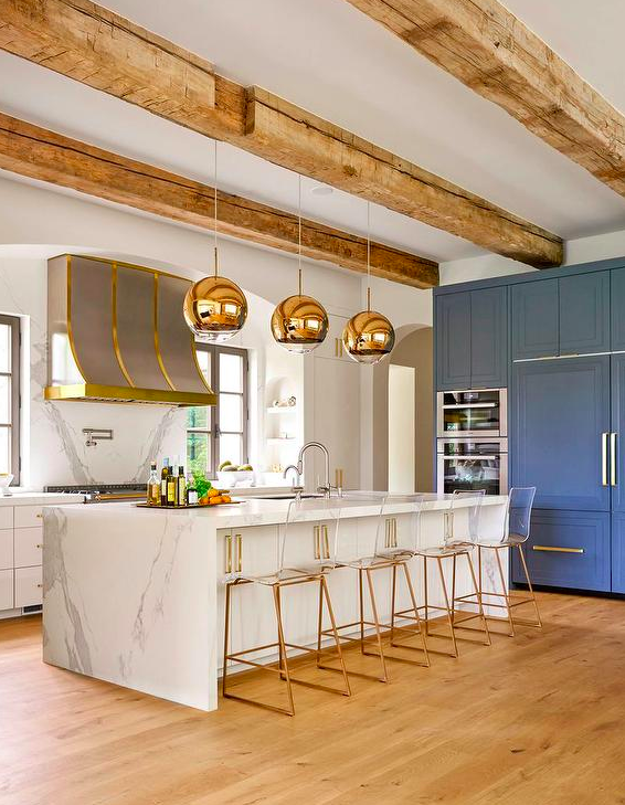
4. CLOSED LEG ISLAND
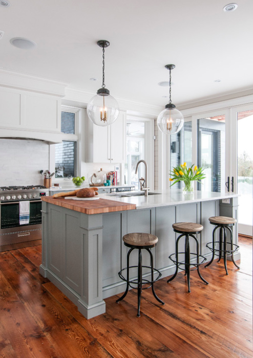
I’m calling this style the “closed leg island” because it’s really the opposite of the “open leg island” with cabinetry panels extending all the way across the width of the island creating an almost inset ‘u’ shape where you sit. Whether it’s one or two cabinets wide in depth, this has a more substantial feel to it because nothing is open from the side. It usually has nice paneling features or can have a waterfall counter which has been a popular feature in recent years (see picture below). I think this is the style we are going with because I really do like the substance it adds to the room. In order for the island inset detail to be more apparent, the cabinetry maker is putting a faux panel in to make the part you sit not very deep. Our counterstools by nature of the arms don’t push in very far and you’ll see the detail work if it isn’t very deep.
5. TWO TIER ISLAND
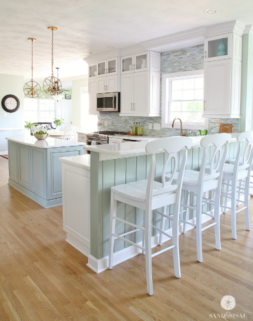
The two tier island has a normal counter top height (36″) and then elevates for a portion to barstool height (42″). My mom has this design and absolutely loves it because her kitchen sink is in the kitchen island and she didn’t want guests to walk in and see dishes by the sink. The elevated bar height means you can hide the everyday ordinary kitchen needs behind the elevated portion. For bar height counter tops you need barstools vs counter stools.
6. OPEN SHELF ISLANDS
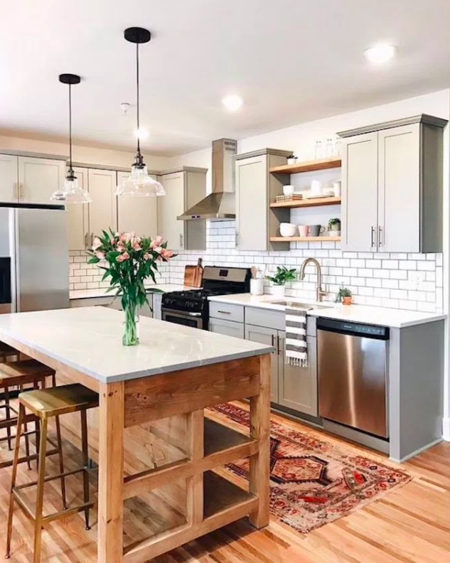
Open shelf islands are becoming more popular. I think for so long the tradition has been to hide everything away in cabinets but with the open shelving trend instead of upper cabinetry in kitchens going strong, it’s now translating to the kitchen island. I like this look but I really did want the hide-ability factor for our kitchen island given the limited upper cabinets in our plans and opted for some open upper shelving. I’m excited to see more kitchens with open islands, I think they are a unique look and very eye-catching and will be a very popular trend.
7. ISLANDS ON WHEELS
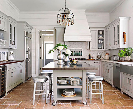
This is an ingenious kitchen island style that if you are designing in a tighter space can be crucial for space optimization. You get the luxury of extra island storage yet can move it off to one side if you’re having a party or need more space. These can range in style and can be a fun statement piece from vintage to modern.
8. NO SEATING ISLANDS
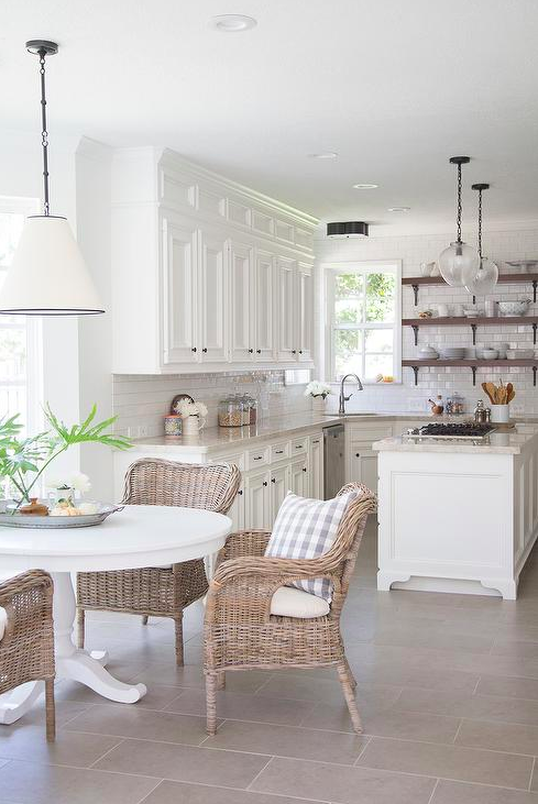
Some kitchens just don’t have the space for an island with seating. You see this often in galley kitchens that are narrow and longer. And sometimes homeowners just want the look of furniture and practicality of an island without seating, especially if there is a breakfast nook just steps away. I do not fall into this camp. I love the gathering spot that kitchens are and have factored an island with seating into our design but that’s the awesome thing about design. There are so many ways to approach your want list and plan.
I hope this post helped inspire your kitchen dreaming. It helped me to survey the options a bit and hash out what I’m wanting. Sometimes you just need to see pictures to know what you want.
None of these pictures are mine and I am making no claims to them whatsoever by featuring them on this blog post. I was purposeful to give credit to the rightful owner and provide the proper links. If I have credited incorrectly please let me know and I will gladly fix my error–likely do to mom brain / toddlers handing on my legs. Happy designing!
3 responses to “Kitchen Island Design”
Leave a Reply


 Back To Home Tour
[…] its square shape. Another idea is to use them like table legs under an extended work surface. Here are several examples. If you don’t want corner posts, using flat strips to make a corner is also […]
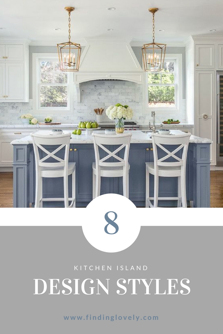
They are all beautiful. Would there be any way to find out what color blue the island is in the second and the last picture? Are those countertops marble in that picture?
I do not know the paint color of the blue island but it looks similar to BM Boothbay Gray. I’d start there and look for a blue with a grey undertone.