HOME TOUR
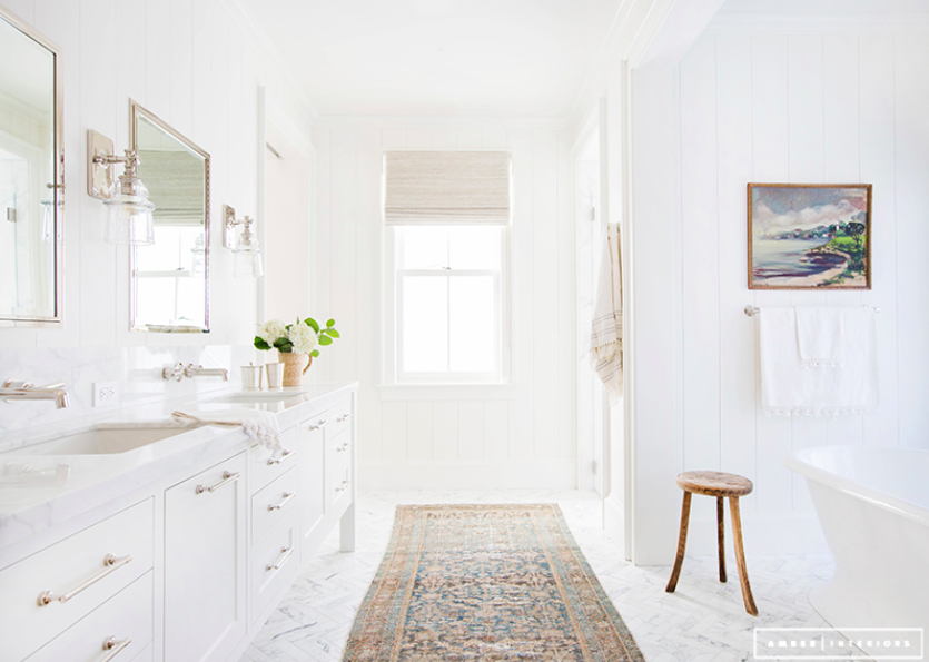
When we first walked through this old home there were a lot of glaringly obvious things we needed to do but I could also envision this future space, this space we are working on now. Where there was once a steep, awkward staircase between the kitchen and family room that led up to a “maids quarter” could become an “open concept” kitchen and family room and above the kitchen could become a master suite, all with a good bit of work. So when it ended up working out that the final drawings almost perfectly matched this initial vision in my head, I was pretty jazzed. The master suite is going to be quite beautiful with vaulted ceilings and millwork and a spectacular fireplace. But simply having our own bathroom is going to be a huge change. We’ve been sharing a bathroom with guests or kiddos since the dawn of time. So this is a huge luxury for which we are over the moon thankful…and with the looming second little dude (hopefully) getting potty trained this summer, it couldn’t have come a more convenient time for this momma.
It feels a bit surreal that we’re even talking about a master bathroom!! Not sharing a bath with a 2 and 3 year old…when I think about that I get a teensy bit excited. Not that I don’t love cloroxing the toilet seat every time I go upstairs to the bathroom. Nope. That’s great and all but…my own toilet seat. Now there’s something I can get really excited about.
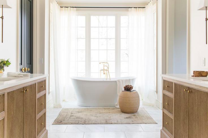
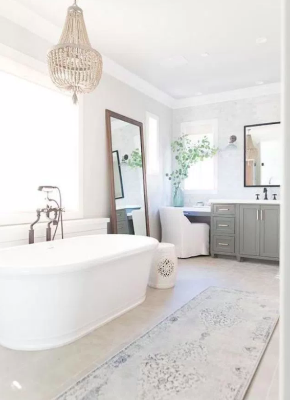
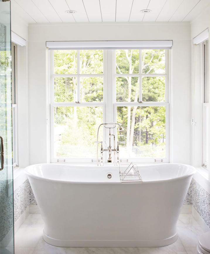
Once again I knew I wanted windows and more windows. There’s something about my need for natural light in New England. I knew I wanted patterned tile on a heated floor and that a freestanding tub was huge on my must-have list. This was actually the only fixture I was quite opinionated about. There are just some tubs out there that look like Noah’s Ark and others that are so frilly fru fru looking (if that’s even a thing). I wanted it to look neither 100% modern or frilly fru fru. There’s got to be a happy medium. And I think I found it. It is gorgeous.
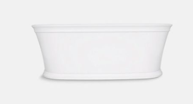
My initial dream tub was the Devon and Devon Celine tub but this bathtub wasn’t to Massachusetts’ code, who the heck knows how that is even possible since it’s a wonderful European brand and a bathtub for Pete’s sake (just one of the many things that drive us crazy about this state). Really? We’re going to complain about a bathtub? Enter eyeball roll and face smack emoji here. Luckily there was a brand new Kohler tub that looked almost identical and apparently is to code. I like it because it has a modern shape with just a bit of detail. It doesn’t flare out too far and isn’t sitting on a large pedestal. It’s subtle and lovely.
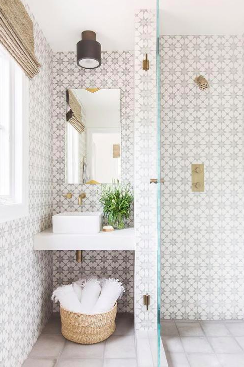
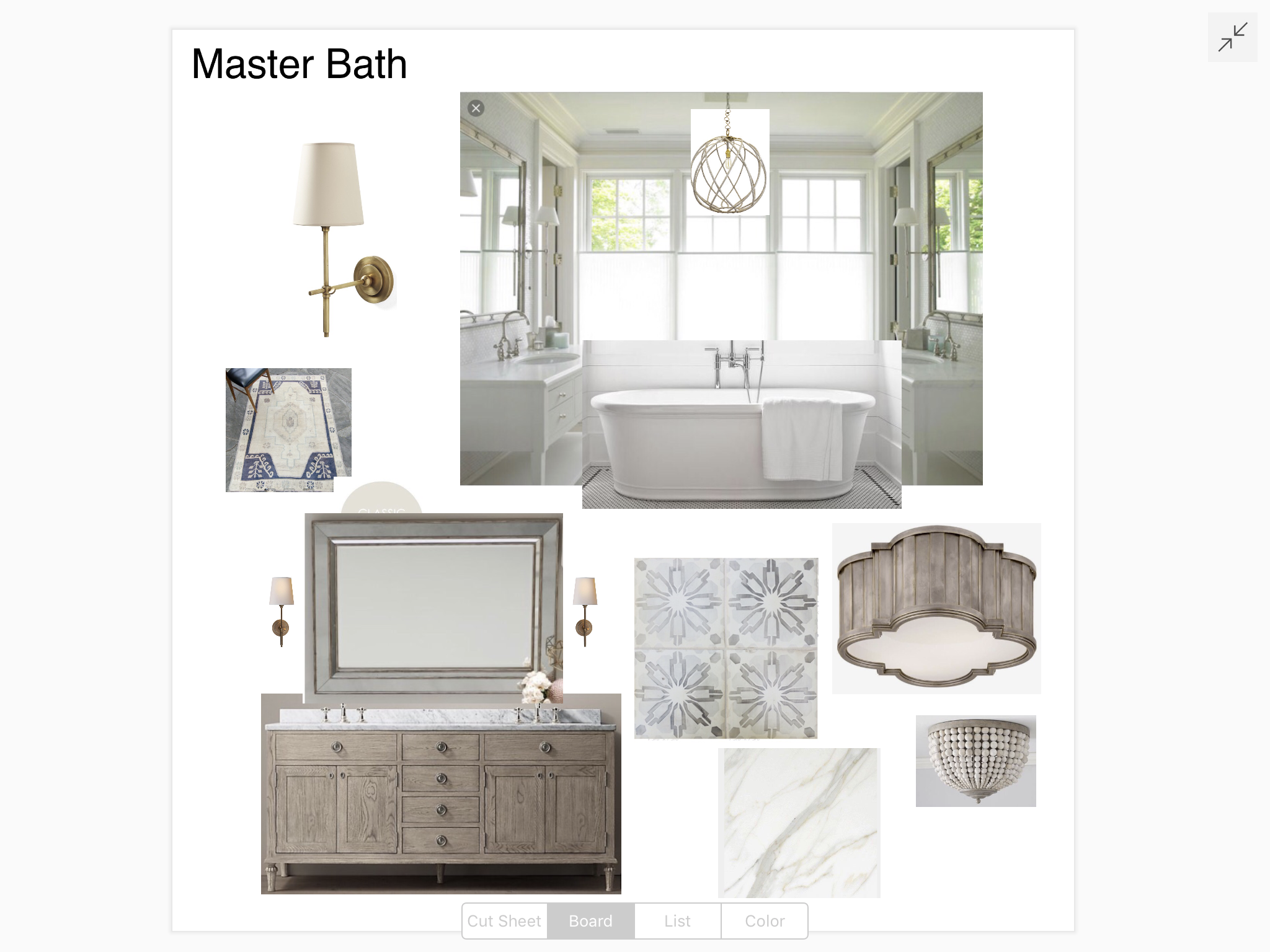
Seems like everyone is still madly in love with patterned tile which is good news because so am I and I really wanted to incorporate it in some of our rooms. I didn’t want to go so bold as a black and white pattern so I opted for a beautiful, subtle hand-painted patterned tile in greys and taupes that will make you weak in the knees. It’s be-autiful and on my design board below.
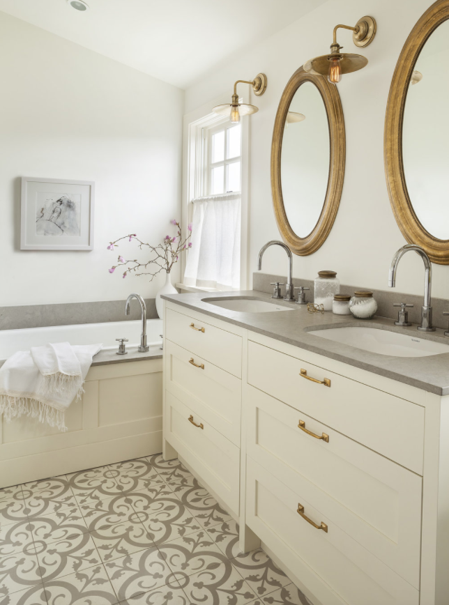
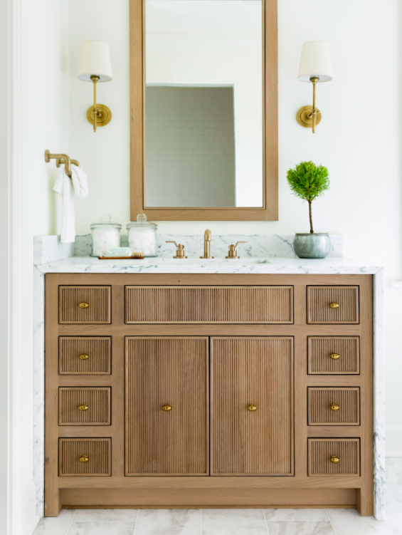
For the double vanity we had toyed with a custom design but we found a really beautiful Restoration Hardware vanity in an aged wood color that checked all my boxes and was much cheaper than custom. I was initially all about white on white on white and normally I’d go that route but the tile we picked has a warmth to it that just looked really pretty with these subtle, aged wood tones. With the walls being white I think it will still have a very light and airy feel.
So without further ado here’s my design board for our master bathroom. The walls will be white, currently an undetermined color but probably BM Chantilly Lace since that is my favorite white or BM Swiss Coffee as it has a tinge of warmth to it and the tile has warmer greys and taupes. We’ll see, I’ll let you know when we decide. But here’s the overall feel of our new bathroom. SO EXCITED! The multiple light fixtures are for the hallway and master closet. What are some things you can’t live without in your master bathroom?
Aside from the design board which is my creation, all the pictures on this post are not mine, I make no claim to them and I have properly linked them to their owners. If I have mislinked a picture, please let me know and I am happy to fix my error which likely occurred while shaking a toddler off my leg or burning dinner. Keeping it real folks. As always, I am so inspired by so many talented designers out there and hope you are too.

Disclosure: This post contain affiliate links with Reward Style, which means I may receive a commission if you click a link and purchase something that I have recommended. Clearly these are all products I use, already have or would put in my home and I am happy to inspire you. Clicking any links on Finding Lovely will not cost you any extra money but it does help me keep this site up and running smoothly with limited ads!
Leave a Reply


 Back To Home Tour