HOME TOUR
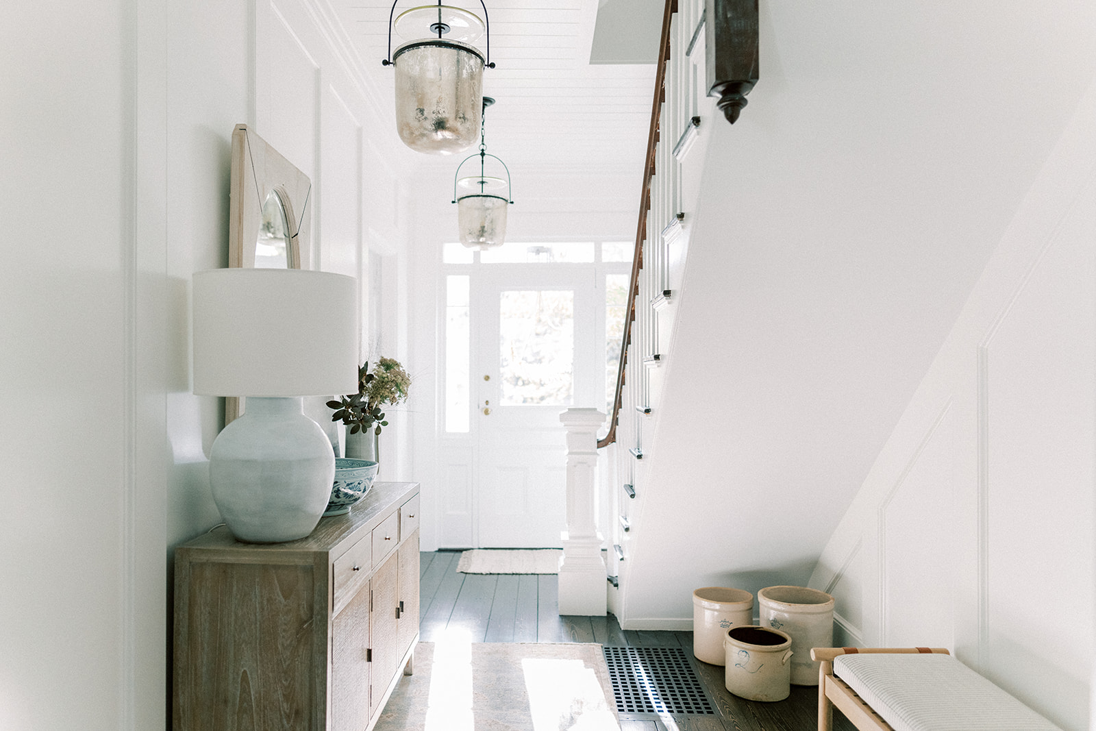
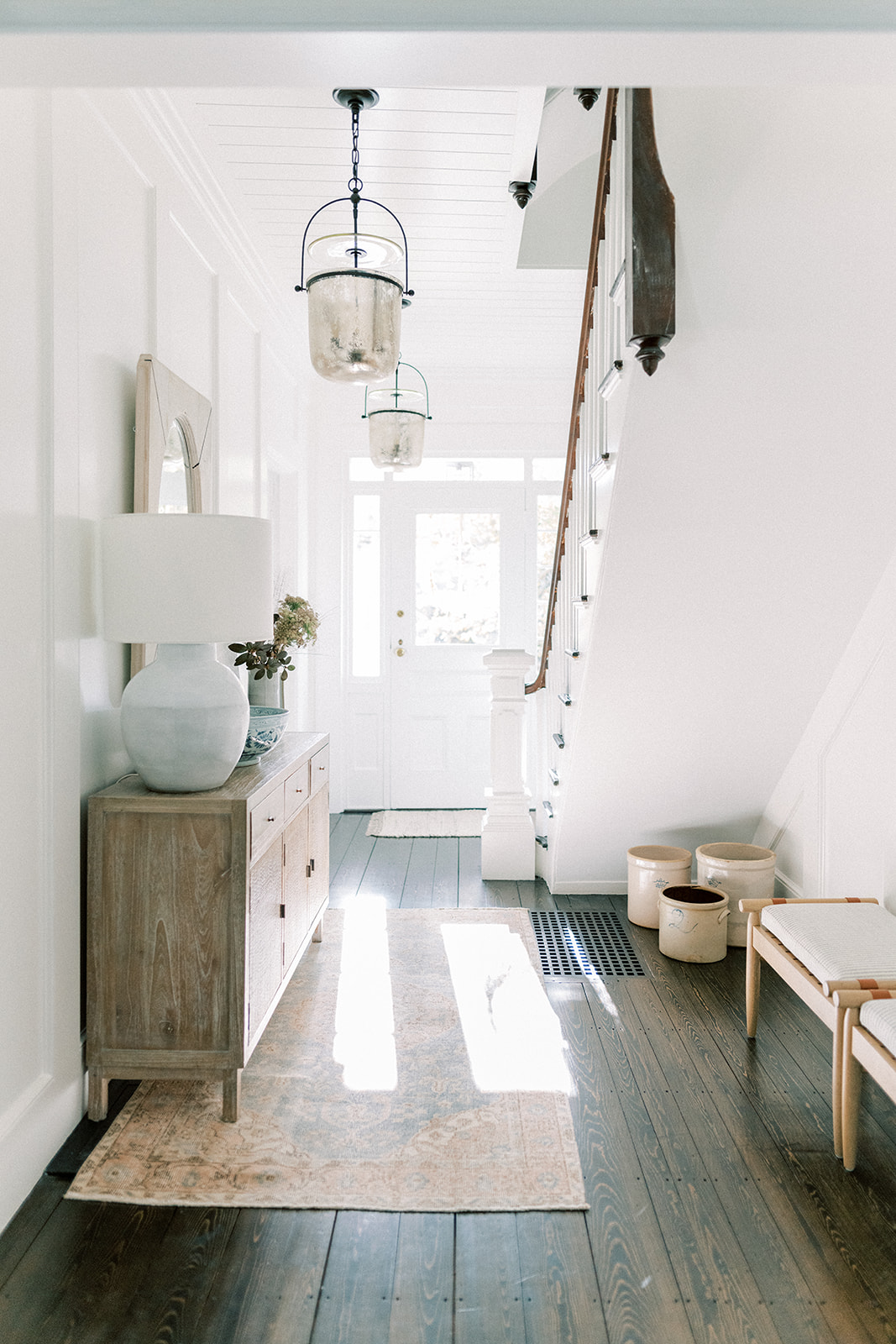
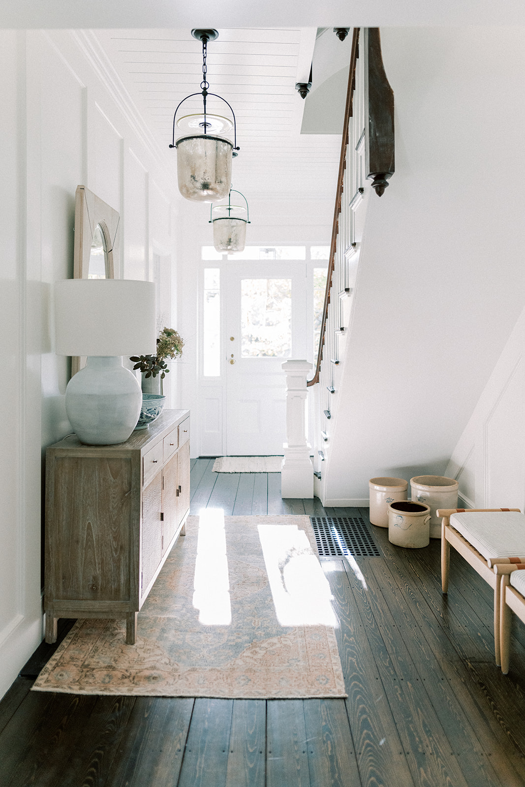
Oh hello there finished entry. Come on in. I love this space. I didn’t realize how much I love this “very forgotten and passed through space” until it got a little love. And by a little, I mean a lot! Every square inch has had something done to it. Tony completely paneled the room and seamlessly sealed old plaster walls safely away. I’ve worked with Adam from Jade Star Builders Inc for Aubrey’s nursery and this space turned out equally beautiful. Adam has an eye for the details and I appreciate that because it’s the details that matter a great deal in design. So come take a peek at the Entryway Refresh captured beautifully by Ruth Eileen Photography.
It was previously a space of cracked plaster walls and a warped metal air return vent that would either puncture your foot if you didn’t pick it up high enough or bang down as you walked over scaring the poop out of you. Sooooo, you can imagine that this is a major upgrade. Now there’s a perfectly fitting wood air return vent that blends seamlessly with the hardwood floors. We haven’t gotten use to it yet because we still look like high stepping horses when we head out to get the mail. The biggest change was probably widening the doorway into the dining room because now it feels like a part of the downstairs.
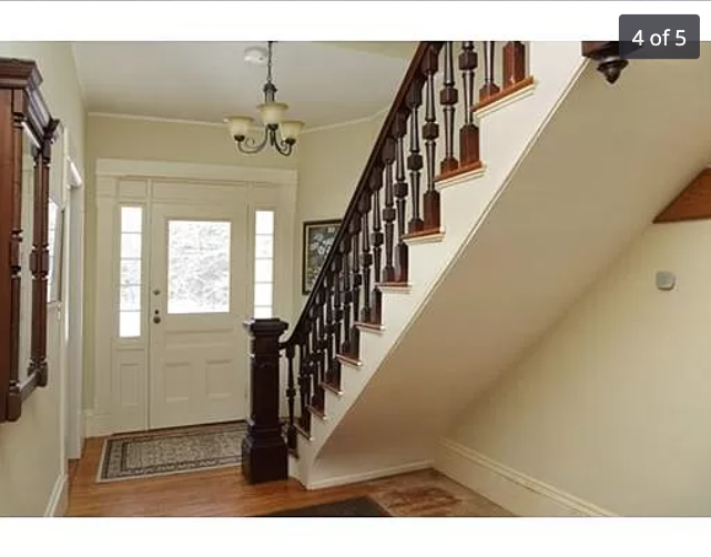
Here’s what it looked like when we moved in:
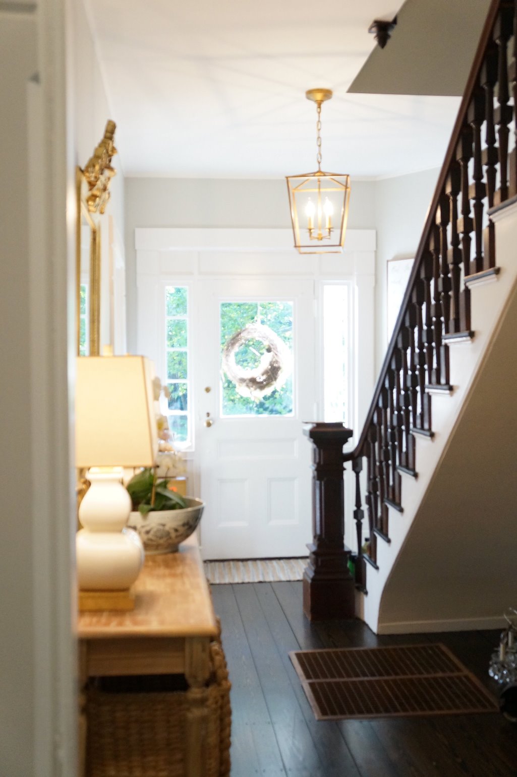
 Here’s the entry “in progress” and you can see more on this blog post:
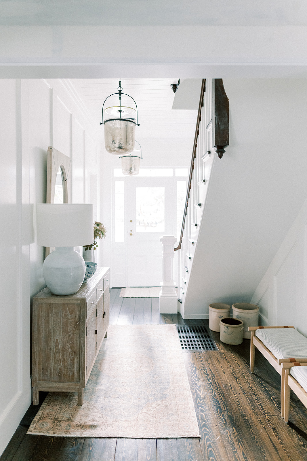
And now in all it’s finished glory:
Such an major upgrade I don’t even know where to start. It’s bright, airy and me. You’ll notice a couple things right off the bat in that original picture above. First off, for some odd reason the original glass was taken out of the top part of the front door surround. We replaced the glass that should have been there all along and it brings in so much more light. Secondly, the floors! The first thing we did when we moved into this old home was rip up the old floors. You can read all about that saga here. Our plan (and budget!) was never to do that but underneath splintering maple floors were the original pine floors from 1879. And I love them. What I didn’t love was the horrible metal air return vent in the middle of the entry and Adam suggested going with a custom wood floor vent that is strong enough to walk on. It’s beautiful and functional.
THE PANELING
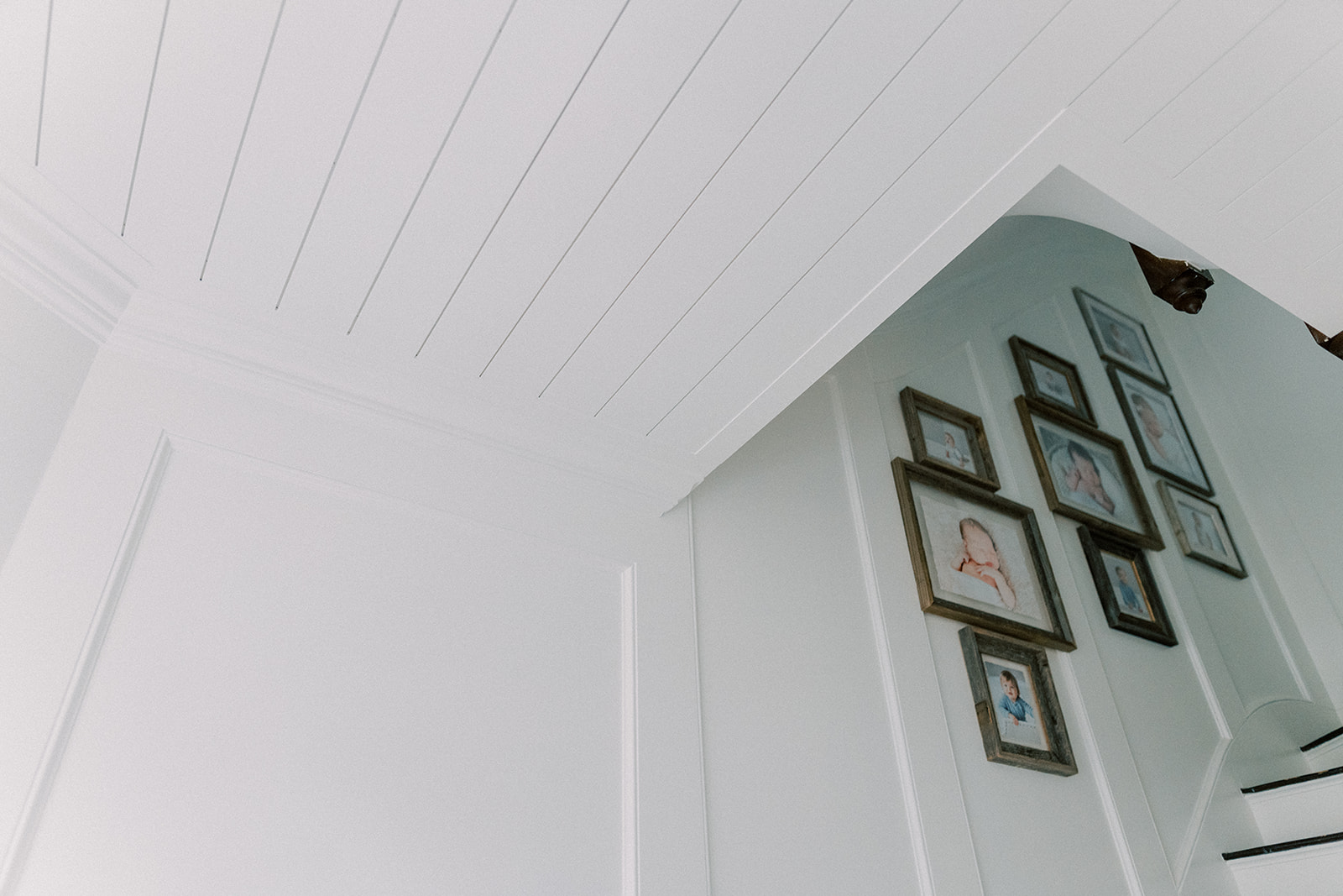
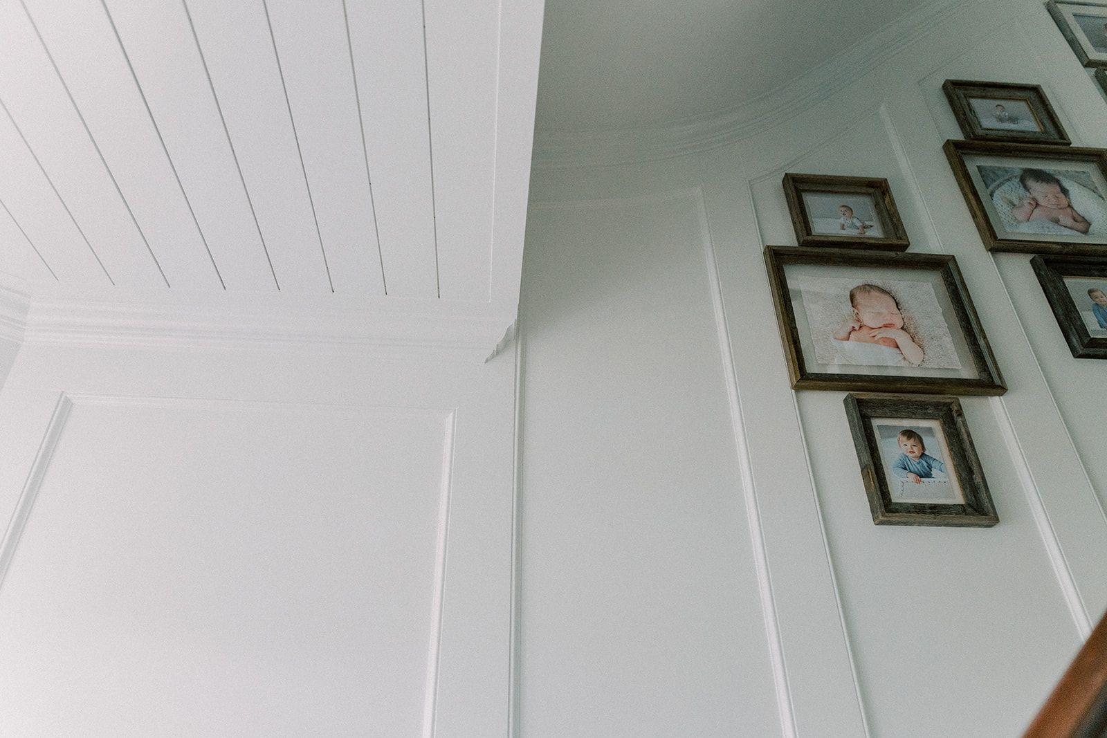
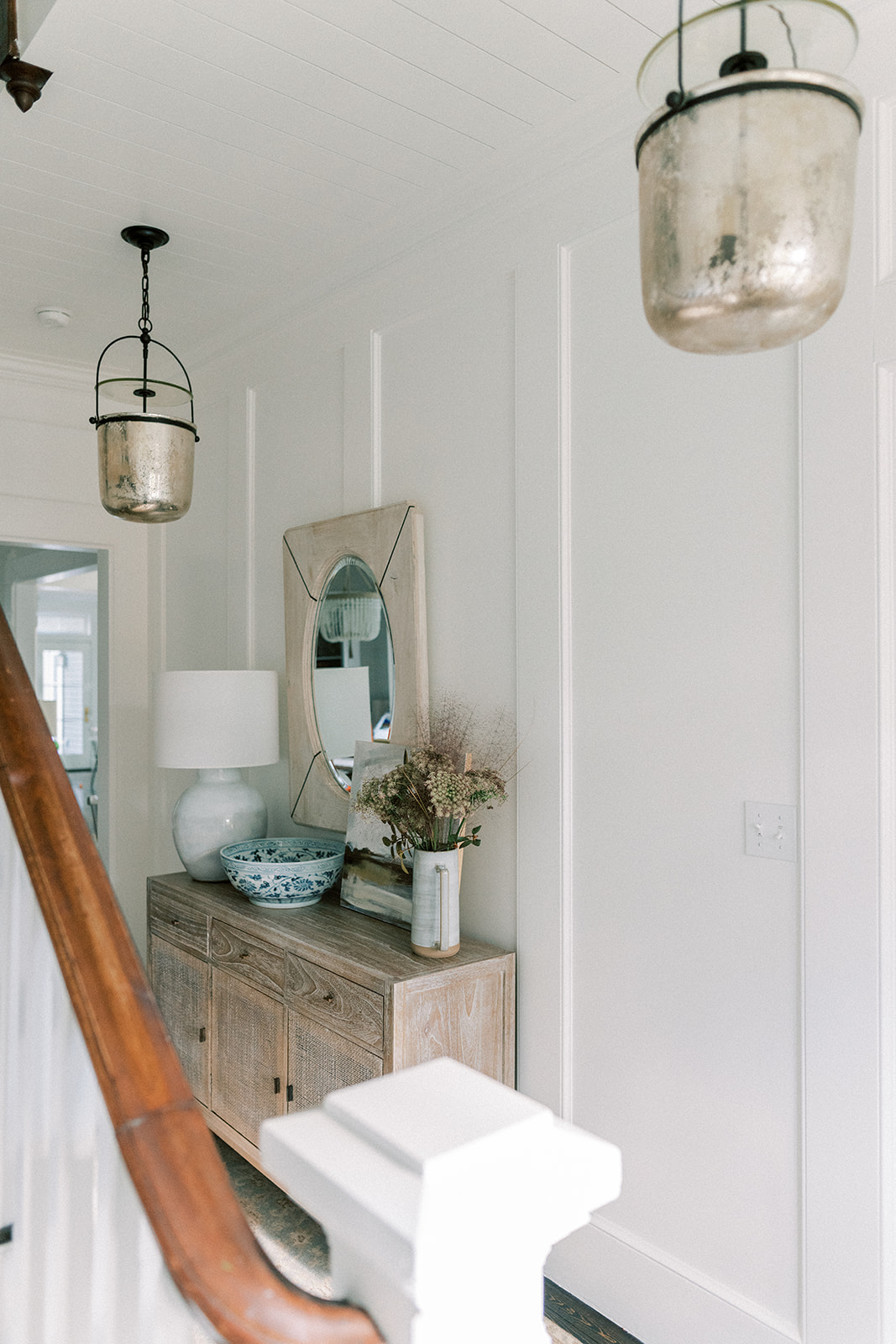
Oh the paneling. I wanted paneled walls but not the typical boxes on top of boxes common to builder-grade box homes. I designed these elongated rectangle inset panels to draw your eye up and while it’s up, take in the beautiful shiplapped ceiling.
But not just your typical “stick some shiplap up there” kind of ceiling, Tony the carpenter inset the shiplap into a frame that goes all around the perimeter of the ceiling. Details. It’s always in the details. The walls and ceiling are BM Chantilly Lace (my favorite white and used just about everywhere in our home). The painters specifically used ceiling paint from Benjamin Moore for the ceiling and walls/trim are in a satin finish.
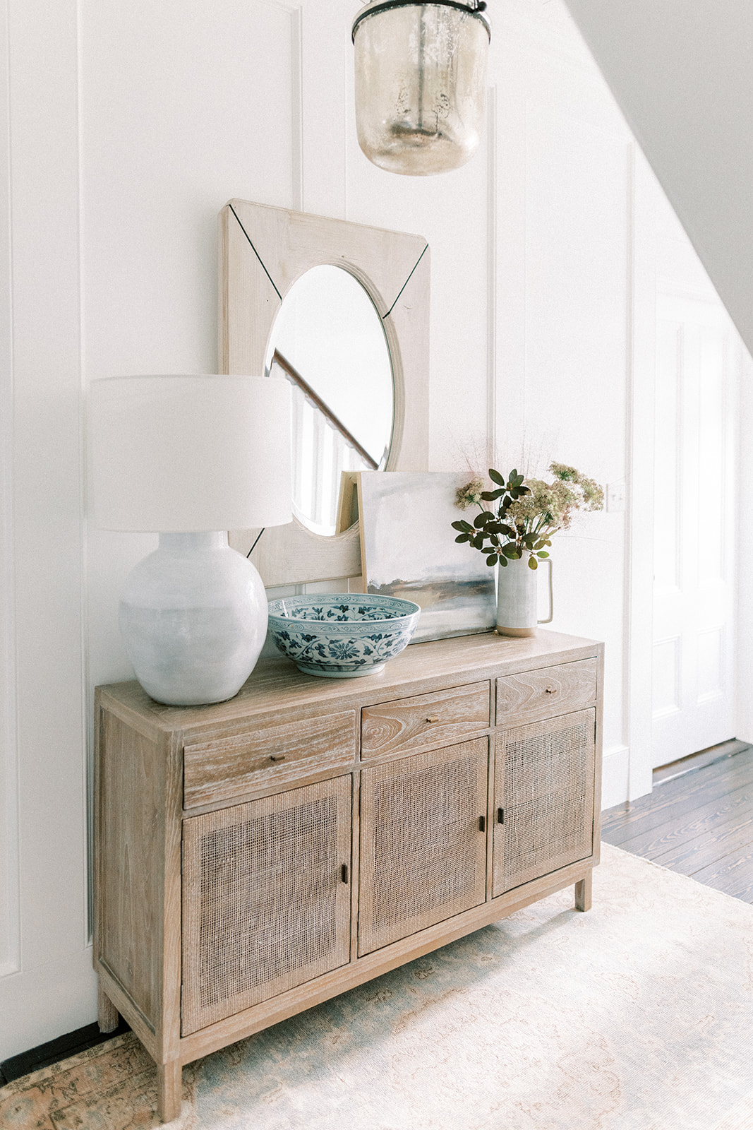
The panels on the downstairs entry wall with the mirror are 25″ wide and the panels heading up the stairs are 23″ wide.
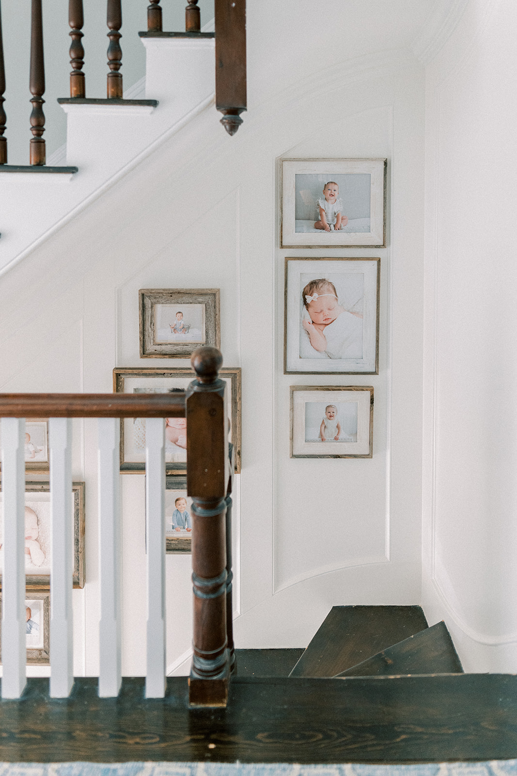
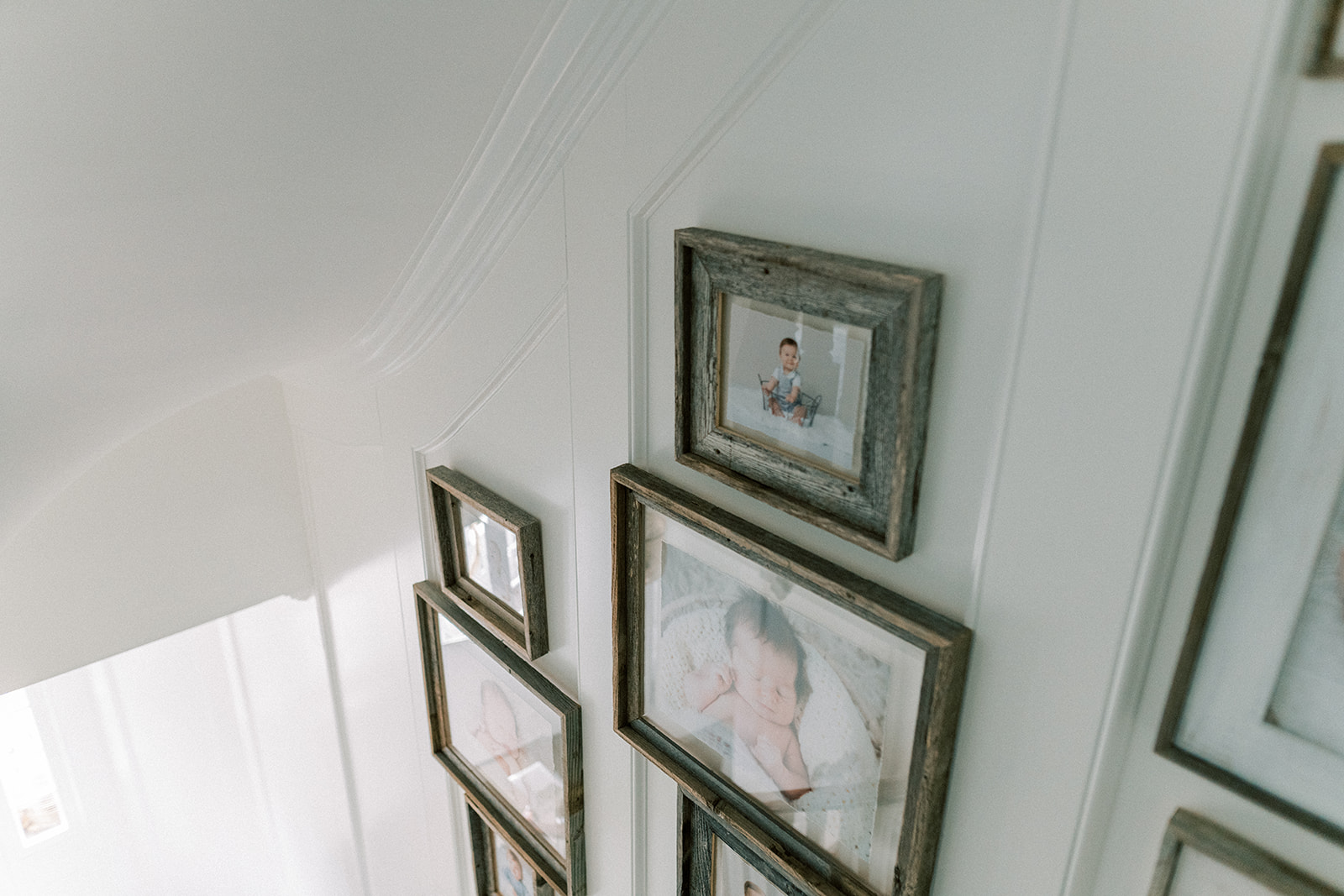
The panels are varying sizes at the base of the stairs and at the top stair landing. We tried to keep the panel width consistent across a wall and made adjustments in size based off how they fell on the wall opting for slightly larger rather than narrower panels.
THE STAIRS
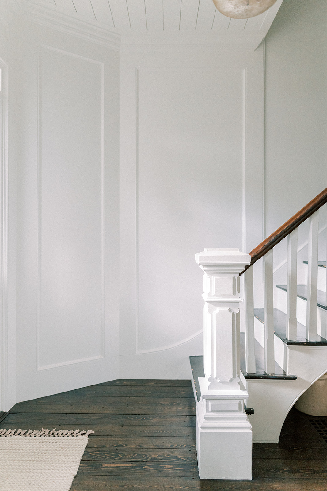
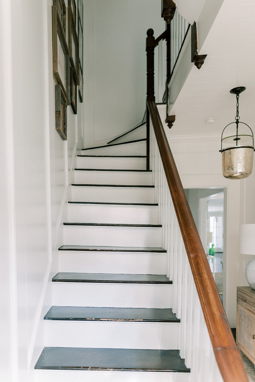
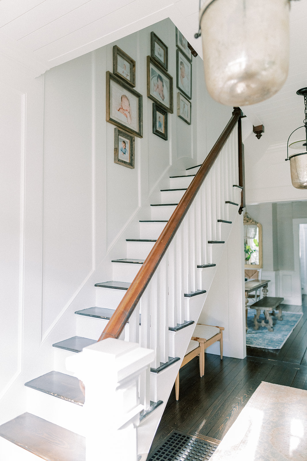
These guys needed an overhaul and frankly everything should have been removed and rebuilt. They’re creaky and 130 years of going up and down them has caused them to lean a bit. A lean that is noticeable to the eye. That however was not in the budget and in it’s current state, not a structural issue. I conceded. We’re still waiting for the hardwood floor guy to come back and touch up the stairs. We changed out the dated (and not original) balusters for more modern and updated ones etched in on the tops and bottoms to match the original trim work detail in our home. The railing is original.
To honor the home we kept both the original downstairs newel (decorative column at the bottom of the staircase) because it’s lovely and in addition, the ones at the top of the stairs. We did have to order special, flexible crown molding from Anderson & McQuaid Co to flank the curve of the stairway ceiling.
I love the curvy slopes to the stairway. Old house details that make my heart pitter patter.
THE LIGHTING
Remember what it was? Just a typical lantern (nothing wrong with that!) but the long and narrow feel to the entry was just calling out for something a little more special. I have loved these Lorford Smoke Bell Lanterns and their timeless yet modern feel for awhile now despite their growing popularity. Seeing them at my friend Jeff’s gallery, Light New England just cinched the deal. We got them in size small. The antique glass speaks to the age of the home while the black iron brings in a touch of modernity that works. And what is better than one bell lantern? Two bell lanterns! And it’s perfection. We reran the electrical to center them on the walkway vs above the newel post. They add a ton of light so we opted to skip recessed ceiling lights.
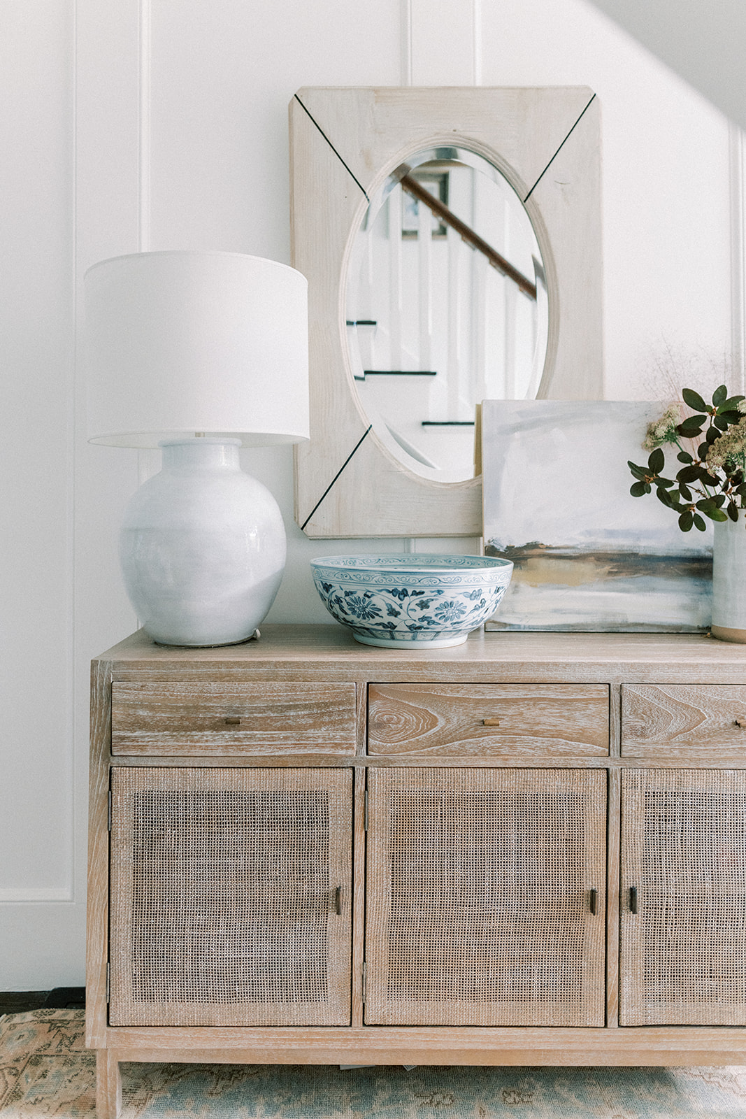
I love how they look with the entryway table lamp. This post here has some close ups. While I was on my hunt for the perfect lights, I sourced a whole bunch of others at various price points. I know good lighting is expensive but there are lots of great options out there to finish off your space nicely. Side note, this is what Black Friday Sales are for! You can save hundreds of dollars. So if there are any updates in your future, try to time the purchase to correspond with a sale. Good lighting is definitely a detail not to be overlooked.
What we did at a Glance:
*Widened the doorway into the dining room
*Added glass panels above the front door, an original feature we restored to the home
*Paneled the walls, Shiplapped the ceiling
*Replaced Balusters going up the stairs
*Bigger crown molding
*Centered and added new pendants lights
*Replaced warped metal air return vent on the floor with custom wooden grate stained to match hardwoods
*Paint on walls and ceiling is Benjamin Moore Chantilly Lace
I hope the Entryway Refresh inspires you to take an ordinary space and add some lovely. Infuse a mix of vintage (collection of vintage crocks under the stairs) with budget (stools from Target) with splurge (Lorford Smoke Bell Lanterns) to pull together a space layered with character and all the lovely details that make it a sweet place to call home.


 Back To Home Tour
[…] Chantilly Lace via Finding Lovely […]